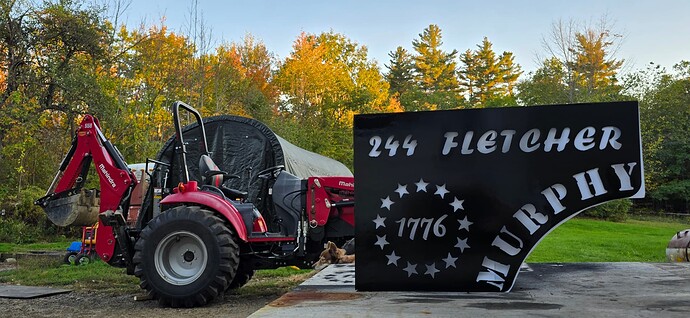
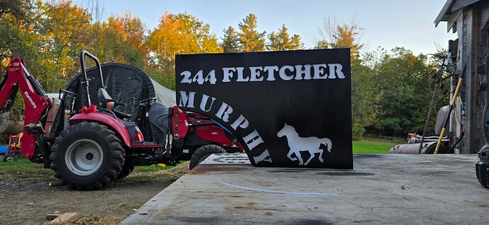
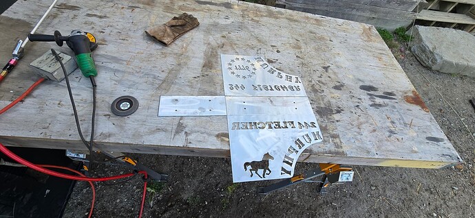
One of the rare times comic sans actually looks good. Nice sign.
You are font of knowledge! ![]()
That’s funny as hell.
Having the word papyrus at the end and not in papyrus font is such a perfect little cherry on top.
And it was in comic sans, so full circle. Lol
Here are a couple more
https://www.instagram.com/p/C3Syk4brSFL/
https://www.instagram.com/p/C2sxcszyLnN/
At my nephew’s funeral service (he was a graphic designer), they had a couple poster boards up one for “Things Michael Loves” and the other “Things Michael Hates”. I proudly wrote Helvetica on the hate board, made my sister laugh out loud.
When I first looked at that, I thought it was fence Gates that Tractor and the bag really makes it look a lot bigger than it is
All about perspective I guess. ![]() The gate idea would be pretty awesome though
The gate idea would be pretty awesome though
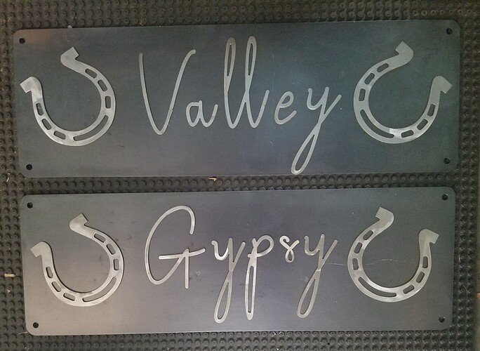
A friend of a friend and her veteran husband adopted two wild mustangs from a government roundup program. There is a PTSD treatment program where vets socialize wild horses that have been rounded up as nuisance animals. They either get adopted or go to a dog food facility. She asked me to cut her some stall entrance signs.
She insisted on a script font, even though I discouraged it. The eventual selection was Broetown. I’m going to apply some gray hammertone on the shoes and she is going to paint and assemble the signs. They are not attached in this picture. Signs are 8" x 24", 16 gauge.
Script fonts can look great. That one totally works.
I like to mash them together or connect them.
Agree. She deserves the credit for it looking cool.
Cutting them scares me due to variation in width on the same letter in so many of them. They are definitely more challenging for me, especially on a small scale.
I was advising her against script because they wanted 24" wide signs and the first three script fonts she liked looked so small in the middle of that much space. I told her I’d add some shoes to fill the space. Shes happy so that’s the best outcome.
Can you provide a pointer to the file?
It’s available from several providers. Just google broetown font.
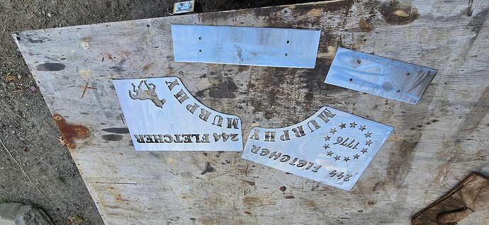
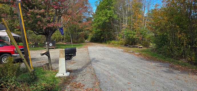
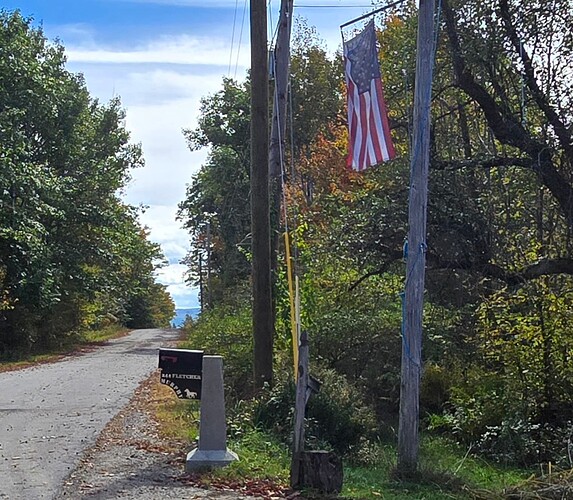
I get alot of stuff from freepatternsarea.com. the mail box i drew in F360 and added some clip art images. The pterodactyl was a link on this forum. The bee came from 3axis.co. they have a ton of stuff on there. I tweak everything to fit what Im doing. So I download the DXF, import to Fusion, start adjusting then post for the nc. file.
Hey Mrs @ChelanJim , he could do nice paint jobs like this if he wasn’t always playing around in Fusion 360 ![]()
Lady requested this as a tribute to her rooster. For you thinking men, there are several jokes hidden in her request.
That is really cool Bret! Thank goodness my wife doesn’t see this stuff. You might give her too many ideas. She is always trying to tell me “Oh, you could get a job at…[fill-in-the-blank]!”
I tell her, “That kind of sucks the joy out of retiring, doesn’t it?”
Not if you enjoy it! You like Drawing in Fusion, What about setting up a business doing Cad for people that cant do it themselves?
You would be doing what you love to do getting paid, and she would be happy cause you would be working!
