Thanks, only way you learn is to try. And if you dont have scrap you are not pushing yourself enough. I crossed my fingers and hit the start button after hours of double checking my design and settings.
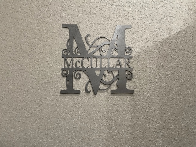
I have the mounts on the back of the sign spacing it about an inch from the wall to give it a shadow look.
3 Likes
That’s some fine intricate cutting. What kind of plasma cutter are you using and what gauge metal?
14 ga with Hypertherm 30xp
I have an Army version pretty well finished (nephew’s Christmas gift) but I have not tried to cut it yet.
I’ll add it to FileShare after I make sure it cuts okay, but if you want to try it:
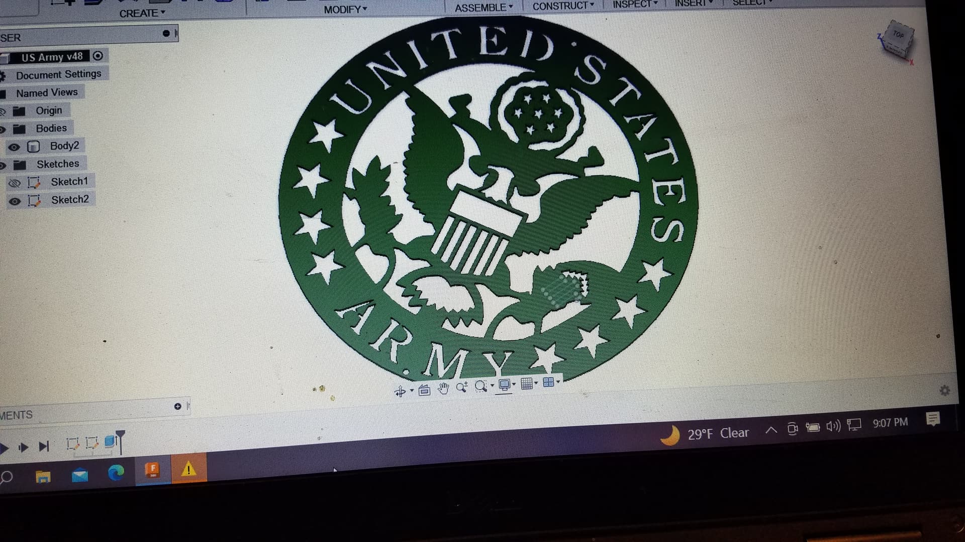
Check those single line arrows and make sure you think they’ll work before I cause you to have scrap.
Army-crest.dxf (475.3 KB)
3 Likes
@MechanicJon Thanks!! It’s an Everlast machine 52i. I use .08 nozzles and cut at 27amps on 16gauge hot roll. The kerf is super consistent so I am pretty comfortable doing stuff like that. I make my brush stroke the same as my kerf in Inkscape and as long as the brush stroke fits I know my design will work. I really like this machine. My friend has a brand new hypertherm sync cutter on an xr table. Even with fine cut consumables in his system he sends his super detailed work to me.
1 Like
Hey @TinWhisperer , I owe you an apology. I thought the only reason you were so knowledgeable about this stuff was because the electrical flow in your brain was aided by those frigid Canadian temps. You know, cold temps lower resistance to electrical flow. Better synaptic throughput and all…
But it’s been below 5F here in Southern Indiana for 3 days and I’m no smarter than I was before. ![]()
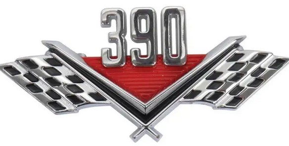
Did get a Ford V8 emblem designed yesterday for a friend.
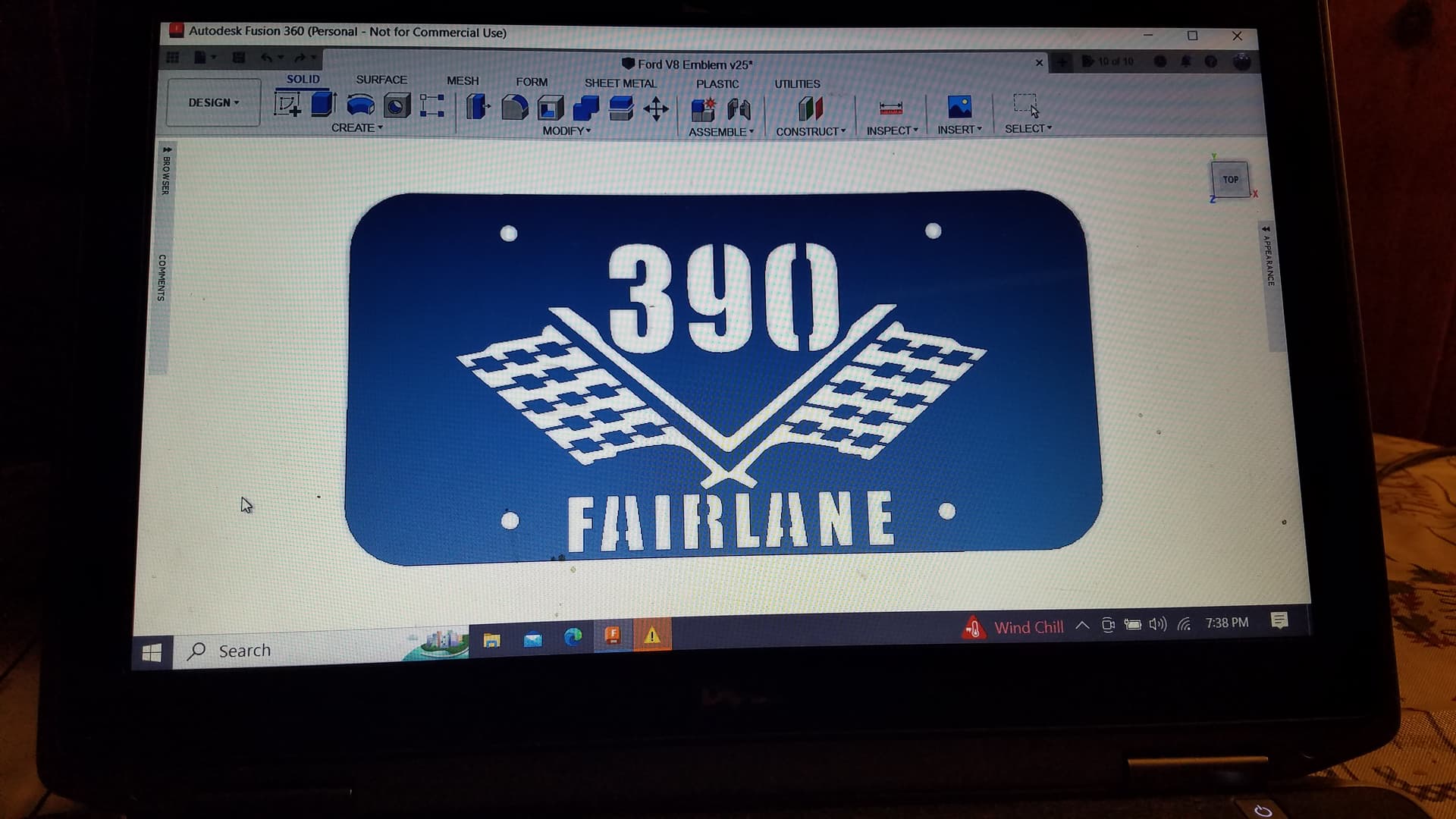
Supposed to match this one:
6 Likes
That’s a great looking design you came up with.
1 Like
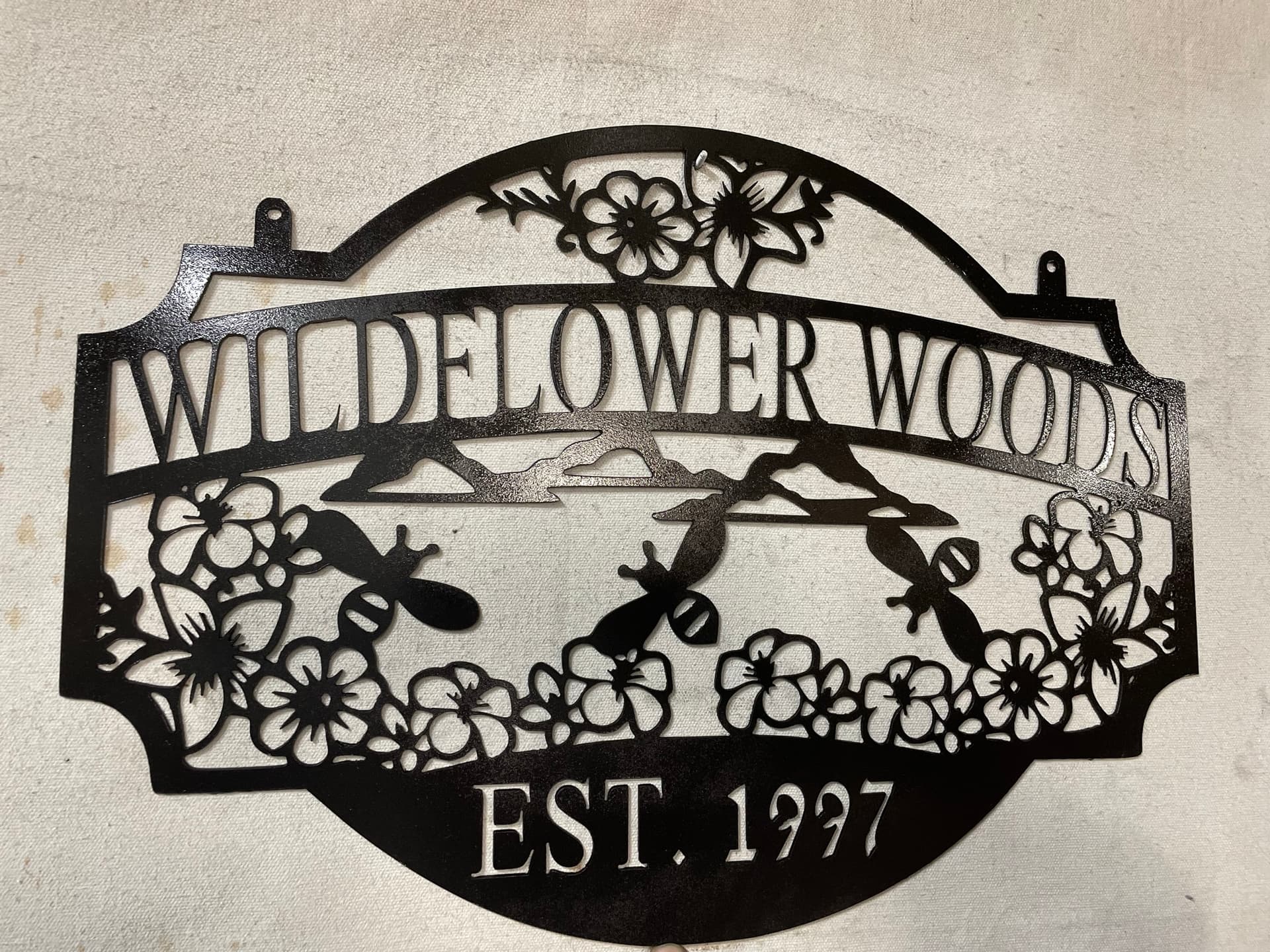
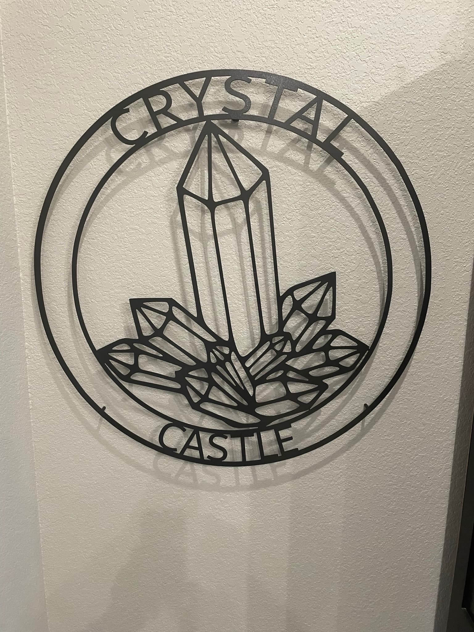
here is what i have done this weekend. the little banner will be attached to the castle i put on here a while back.
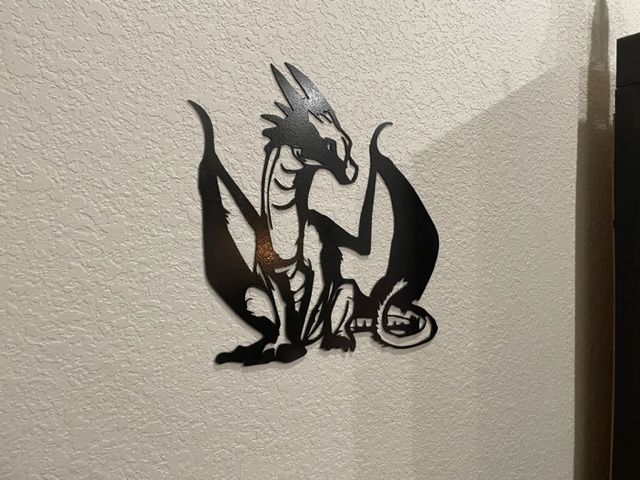
5 Likes
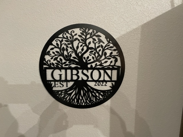
A friend posted a similar wood ornament that a family member gave him. I drew one up in Inkscape this morning.

4 Likes
Looks like you got the settings for that intricate cutting down. That tree of life and the dragon both have some narrow spots that would tighten my shorts just before I hit Start in FireControl.
Nice!
1 Like
once i got the kerf dialed in it helps immensely on those areas, i actually progam my kerf to be 1/100th larger than what it actually is…gives me a little latitude in those really tight regions but mentally it relaxes me… I mostly design in inkscape and i set my stroke to be the same width as my kerf. that way i always know the design will work out once run through plasmacam… as long as my kerf is accurate plasmacam hasn’t let me down yet.
2 Likes
That’s great advice.
I need to run some trials and measure my kerf really closely with various electrodes and amperage/air pressure settings. I need to quit living in fear (and wasting steel) and get some data!
1 Like
Hi. Sorry for long delay. I missed this. It is 16g hot roll and using everlast 52i with .08 tip.
1 Like
Here is a memorial sign I did today. It is 5 layers. The second and third are mounted a half inch above the base layer with rivnuts. The black banner is riveted to the third layer and the letters are affixed with mounting tape.
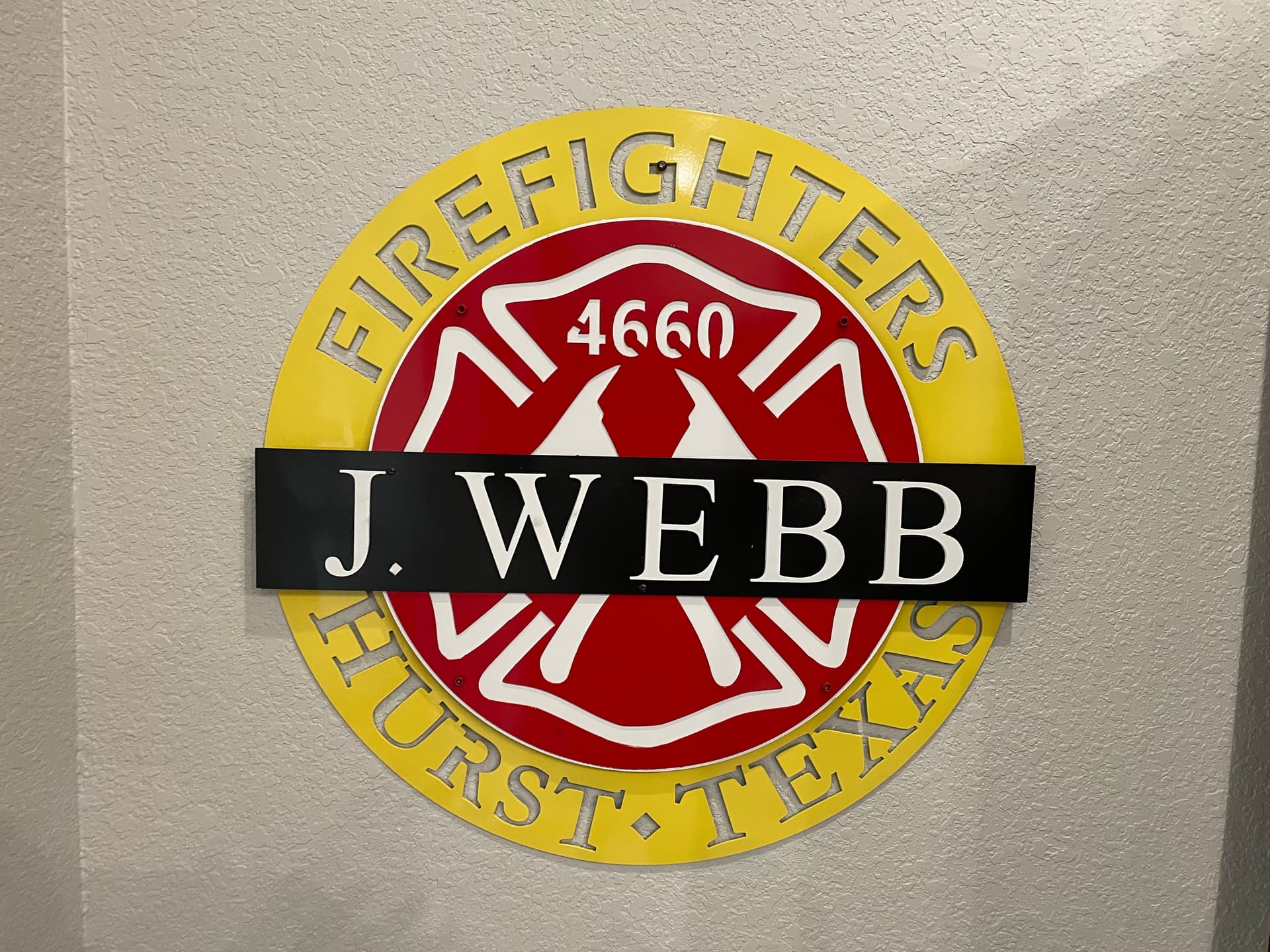
8 Likes
Just out of curiosity what size is that? what gauge? and what do you think it weighs
Classy looking sign. I like the small diamond near the bottom. Sometimes the small touches really add to a design. And using the rivnut approach is a great idea.
I have a rivnut gun. I haven’t used it in a year or so and never thought about using it to make multilayered signs. That could really get fun.
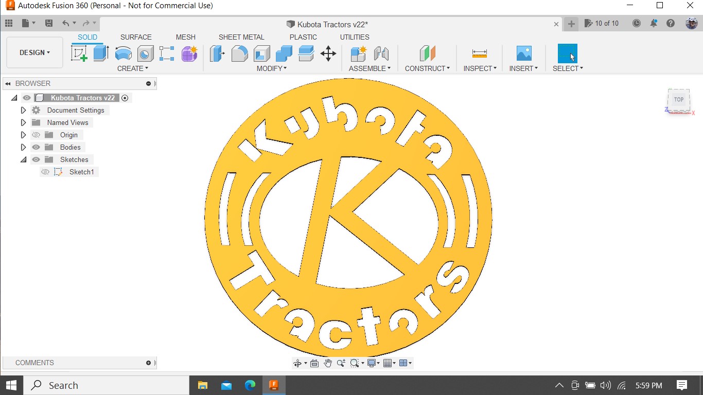
I did design a basic Kubota Tractor sign yesterday, but not real happy with it. Kubota has their own font with cutouts in the letters. Not my idea.
Putting an oval shaped logo on a round sign,… Only did it that way to try to save material. Appearance not so good IMO.
1 Like
@Knick the outer diameter is 24 inches. its not as heavy as it could have been. the bottom layer is not solid. i cut the center out for weigh considerations. It weighs 13 pounds. it is 16g.
i thought about using acrylic for the white background in the center, that would have saved a couple pounds but during design I wasn’t sure how i was going to mount everything and was worried there might be welding involved. One fantastic aspect about being bolted or screwed together…when you screw up some paint…which i did twice!!! its far easier to take apart and deal with one blem color instead of masking multiple layers and screwing up other paint while you try to fix the first. @Wsidr1 Thank you. This is a sign that i am donating anonymously to the department of the fallen firefighter. Usually i would promote a sign like this but not doing that with this one, this is not something i want to benefit financially from. I hesitated even putting it here but I don’t really expect anyone here to by a sign from me as you guys are making your own! I put it here just to stimulate brains…and share techniques. I hadn’t ever thought of rivnuts before either and they worked so good i thought you guys might benefit from seeing them in practice. The Kubota sign has potential. your right though…the oval and circle make it tough to decide what path to put what on. I find with some designs a smaller oval is preferential to a larger circle, if that makes sense at all…if I see one shape being more eye appealing over another I usually try to sell my customer on that concept. For basic single layer signs I compute a price just height x’s width x’s (x cents) = cost i dont calculate actual square inches so usually it really doesnt affect price very much but final product looks more balanced.
2 Likes
Yeah, I tried to use the partial circle shapes and I placed the text to try to transition between circle and oval, but I think it still needs work.
It’s just going on my tractor shed door, so I shouldn’t be too picky, but then, well, you know…
Kubota example of the text and logo

1 Like
Final signs of 2022 I think. the detail in some of the dumptruck is pretty impressive i think. Little video mix i put together just for fun
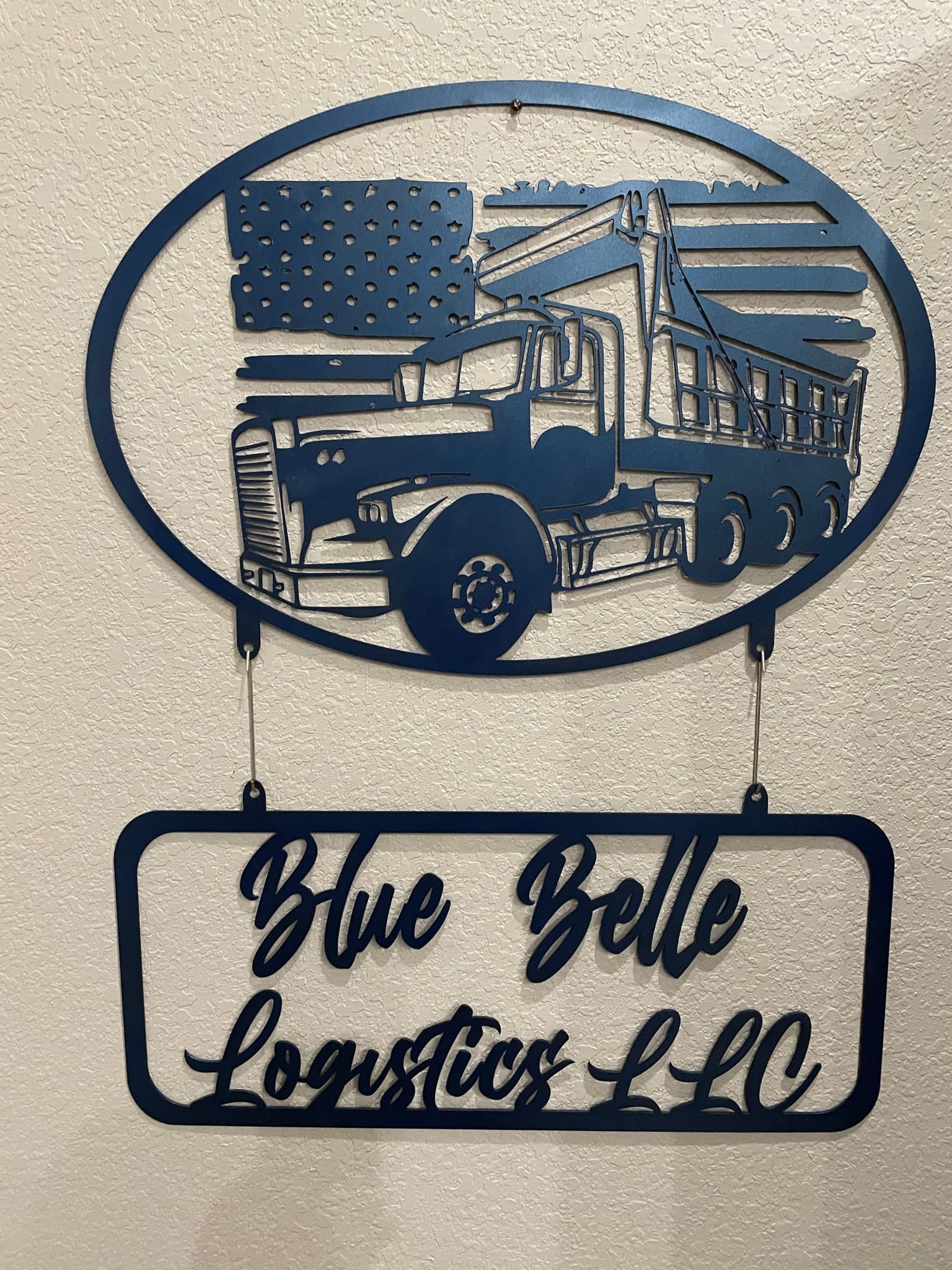
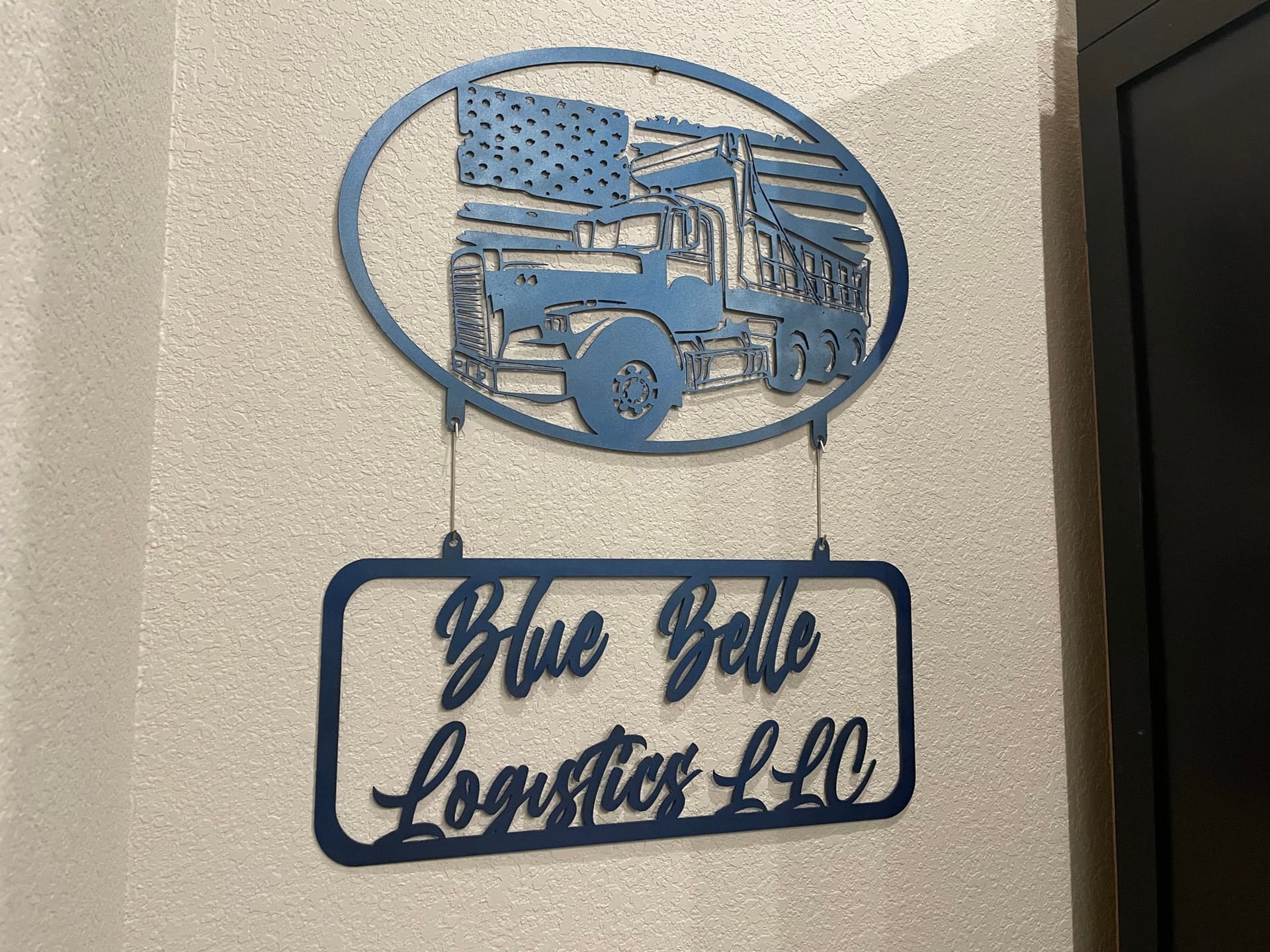
9 Likes
Dayum! That tri-axle detail is amazing.
Any chance you’ll post that to file share? I have a friend whose son does hauling. He’d love it if I could make him a copy of that.
If not, I understand perfectly. No problem.