My latest Project is a Fuel / Starter Field Caddy (it’s on Fireshare too). My lifelong hobby is RC Model Airplanes and Helicopters.
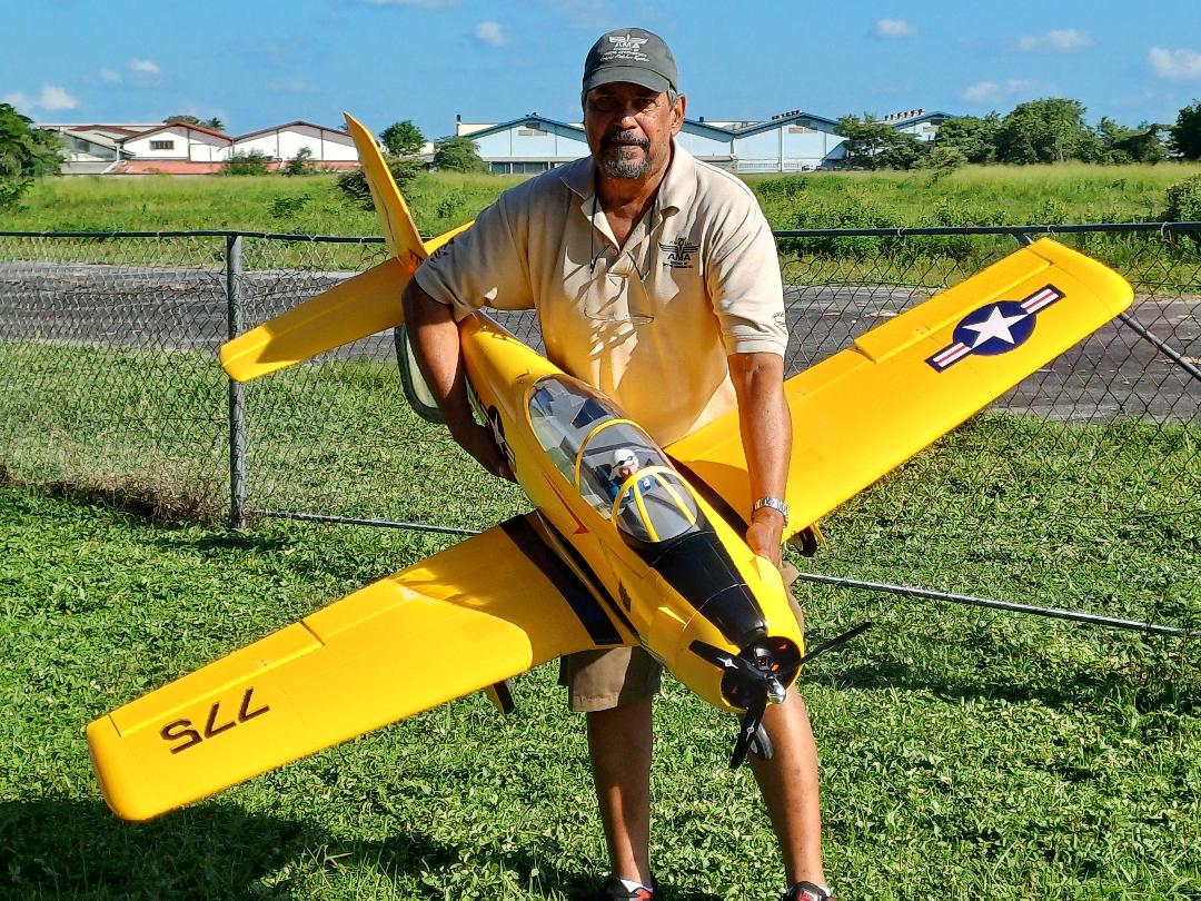
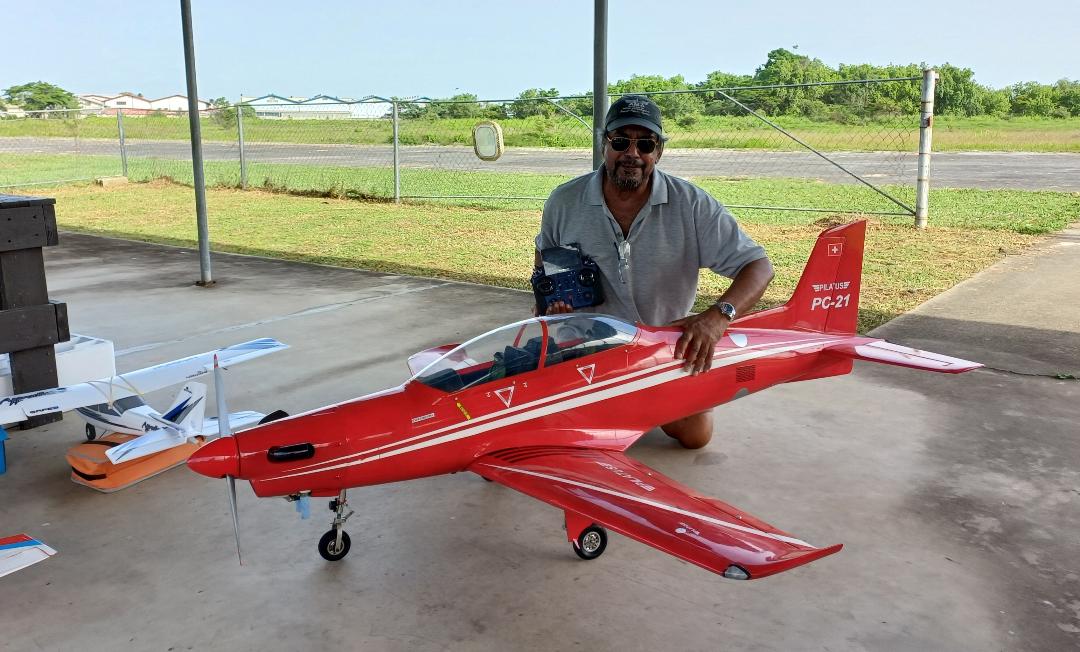
Below are a couple pics of some of my latest builds Pilatus PC-21 and T-28 Trojan.
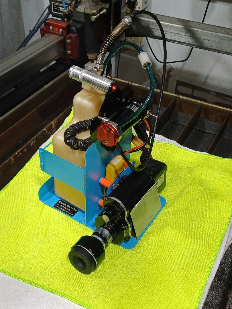

My latest Project is a Fuel / Starter Field Caddy (it’s on Fireshare too). My lifelong hobby is RC Model Airplanes and Helicopters.
Below are a couple pics of some of my latest builds Pilatus PC-21 and T-28 Trojan.
That is such a cool hobby. Always wanted to be a pilot. At first I thought those cows were just models posed by the runway. But not likely that you would put one on the runway!!!
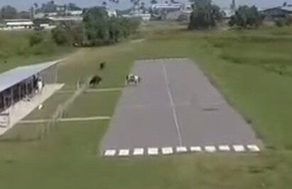
A good variety of aircraft by our members too, turbine jets, helicopters, drones, scale warbirds. Here’s our field opening ceremony before we had the shed.
 Opening of the Mike De Freitas RC Field")
5 posts were split to a new topic: Expensive Hobbies
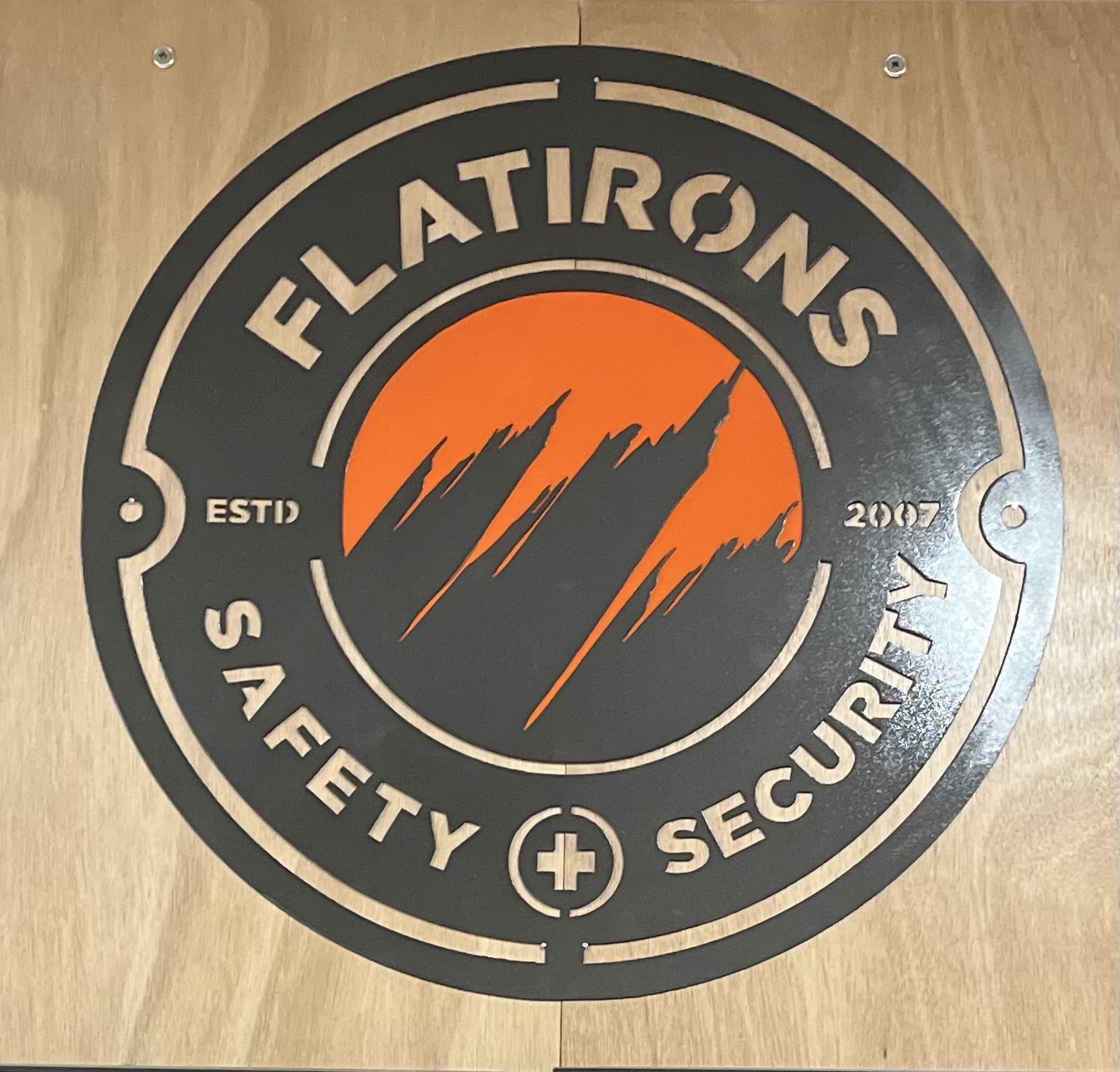
made a “sign post” for the driveway to Washington Fruit’s office.
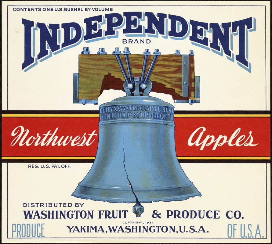
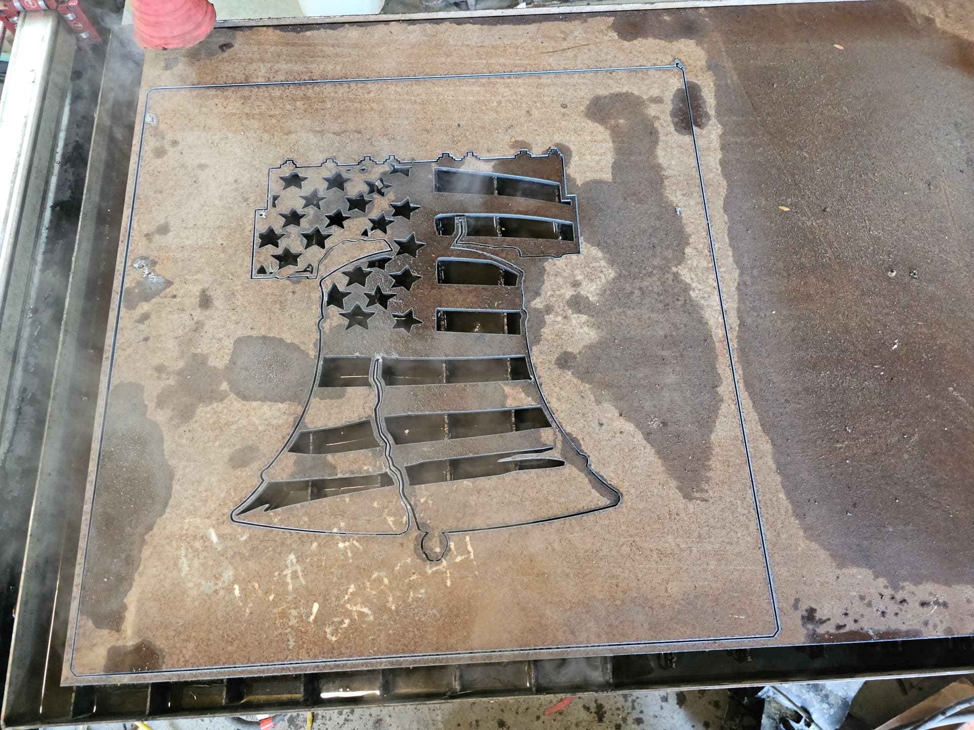
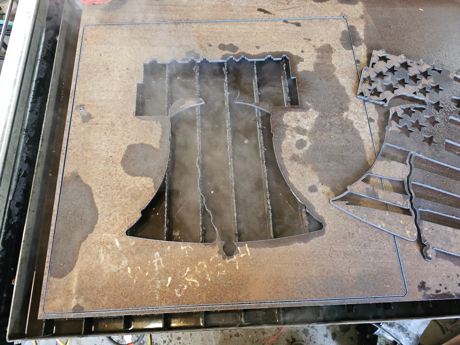
google kept sending the fruit trucks down the driveway to the office instead of the ship dock down the road. the clearance 12’ sign was suspended from a cable between to telephone poles sunk in the dirt. the weight of the cable kept pulling the posts together. i was tasked with finding a solution. this is what i ended up with. the truss is made of HSS 2x3x.188 stringers and verticals, the diagonals are HSS 2x2x.188, posts are 8" sch-40 pipe sunk in the ground 4’ with a shitload of concrete. i traced the liberty bell off of their fruit label. its cut from 1/4" CR P&O plate. the entire thing was flash rusted with salt, peroxide and vinegar .
since i was going to end up with the drops from the project i decided to make the bell into wall art. found a tattered flag on Fireshare (thanks Chris Tyndall) and merged the files. took way longer than i wanted editing the cut file. i started with a trace file from Inkscape, ended up retracing it in AutoCAD the hard way. just didnt like the way it looked. usually Inkscape does an ok job of tracing images, not so much this time.
there was a total of 57 hours of union labor on this project, total cost of labor was just under $9200. materials were all leftovers from previous jobs this last year so they were paid for already. excavation and concrete was done by Mountain States Construction.
video below, sorry its long and drawn out. no editing…
“To the stars that listen and the dreams that are answered”. Extra points if you know the book reference. This is for my daughter for her wedding reception. She and her fiancé met discussing this book.
I Love playing with Torch bluing, you can really have fun with the different colors.
A Court of Thorns of Roses?
Close. Very close. Correct author
A Court of Frost and Starlight.
A court of mist and fury. (Per two of my daugters…and if i were you I’d be a little wary that your daughter met a dude discussing fairy porn. ![]()
So talking over fairy porn is bad?![]()
![]()
![]()
He didn’t say ‘bad’. He was just suggesting that he’d be ‘wary’… Now that could mean LOTS of things, although, now that I think of it, few of them would be good… well, for the daughter anyway. ![]()
Let me expound a bit. My crew consists of two of my daughters so, sadly, we have an inordinate amount of truck time quite often. As all daughters do, mine love to embarass and harass their father at any opportunity. They are both fanatics with these books and will sometimes have inappropriate conversations because they know how much this annoys me. I’ve also been forced to make similar art pieces based on this series for them so that is how I knew about it.
I was also informed that we are taking at least 3 days off come Jan 21 because there is a new book coming out in this series and they must have the time off for it.
From what I begrudgingly know about these novels it is some very raunchy racy fantasy crap that I want to know absolutely nothing about. It just never struck me as anything guys would be interested in.
LOL! I can only imagine! ![]()
Indeed!
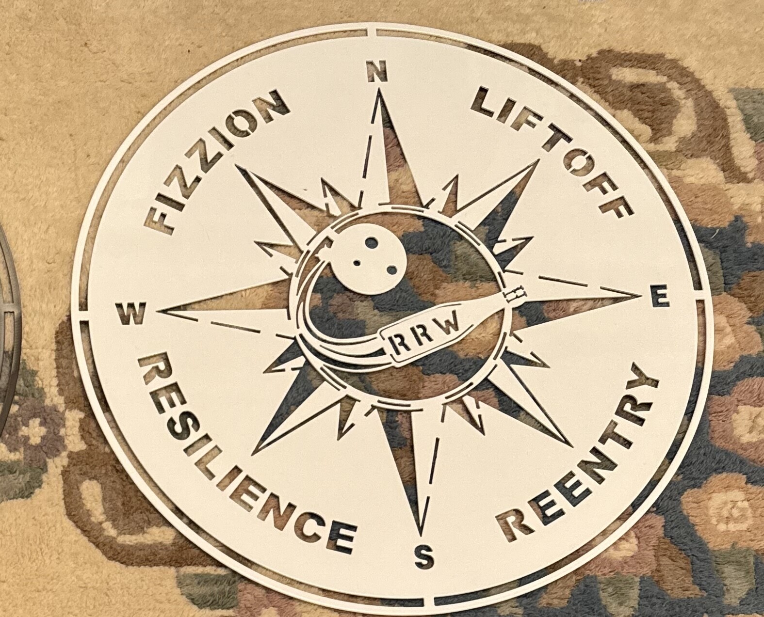
Sign for a winery. Just starting out so any constructive criticism is welcome. Don’t really wanna do signs would like to get into industrial parts, but it helps to learn the software’s. Had a local Company powder coat.
I think it looks good. As a sign maker you can’t really mess with customer art so if that’s their logo/signage you can recommend tweaks but shouldn’t unilaterally make them.
That being said, I’d move the N/E/S/W letters outboard a little to visually distinguish them as part of the compass rose. They could (should from my design aesthetic ![]() ) be larger. If I were designing the logo I would have made them in a different font as well to keep the compass rose more unified and distinct from the motto.
) be larger. If I were designing the logo I would have made them in a different font as well to keep the compass rose more unified and distinct from the motto.
I’d also center the motto words along the arcs between the star points. Resilience looks shifted upward towards the W ordinal.