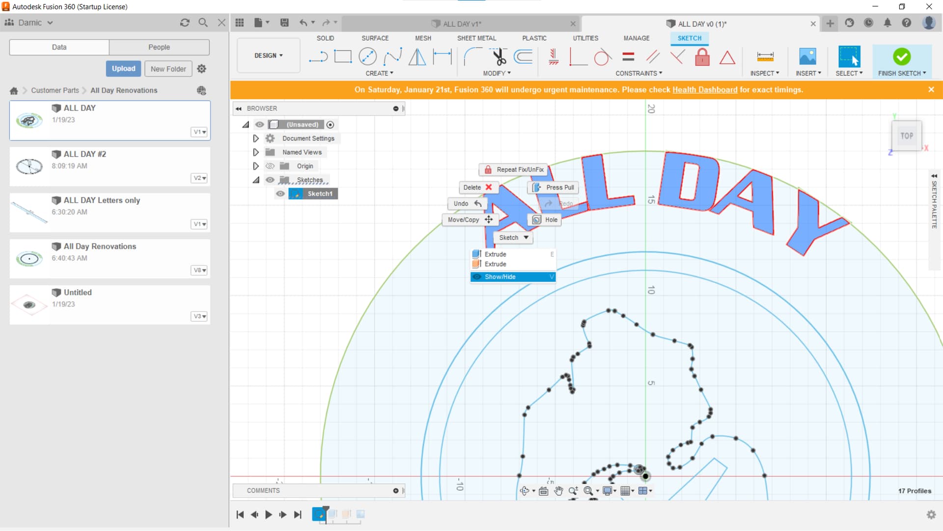
Are you double clicking on a line segment to select the entire letter? After that, you can hold down the control key and keep doing that on each subsequent letter until you have selected them all.
I mean, you can Unfix each letter separately, just faster if you select them all. Then, right click, and use the Unfix.
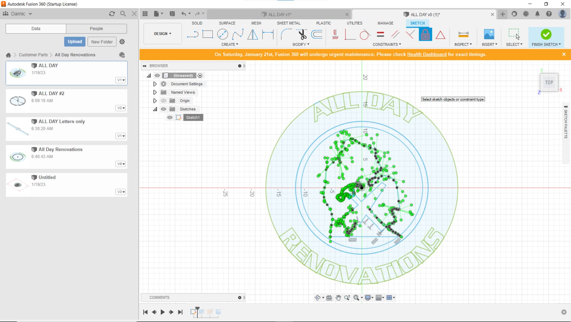
I went ahead and unlocked the letters. I know you want to learn on your own, so I left them needing a lot of placement work. All Day Reno 1.dxf (105.8 KB)
Yes this is turning into a big mess due to me not being clear. I apologize for not getting to the point, I was rushed and did not follow through. What I did not mention was when I went to the manufacture space I had a square box show up that covered part of the drawing. Once I saw that I gave up and uploaded the file and dropped the ball.
So I went back tonight and it seems normal. I am lost as to what happened. I am not going to try and ask for help again without doing a better job of explaining what is going on. Sorry for wasting your time!
So now I try the Fix/unfix button on the toolbar and when I click on it the highlite turns off and nothing else happens. Click it twice nothing changes?
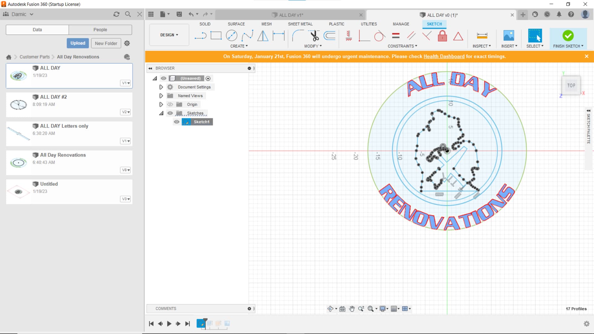
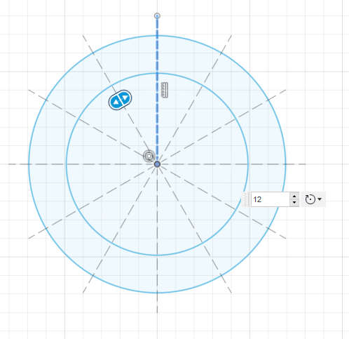
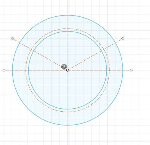
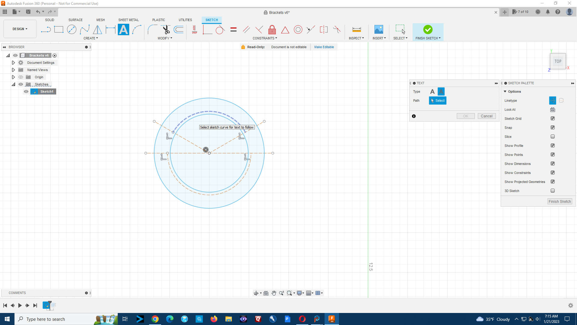
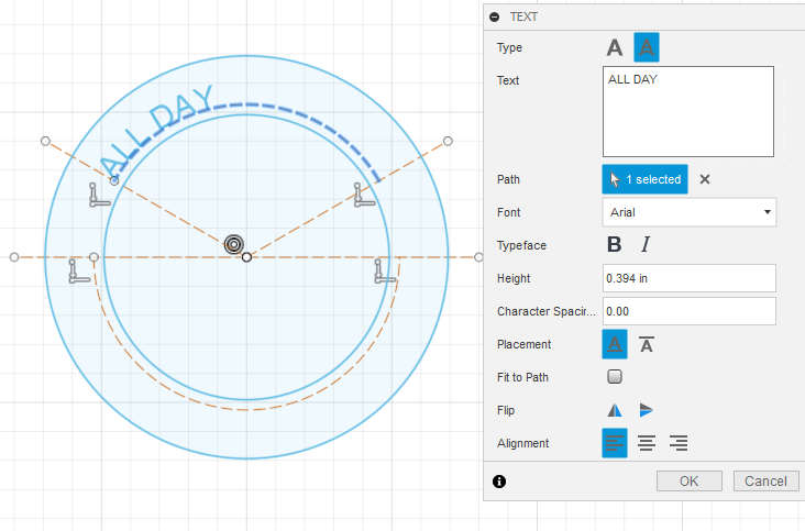
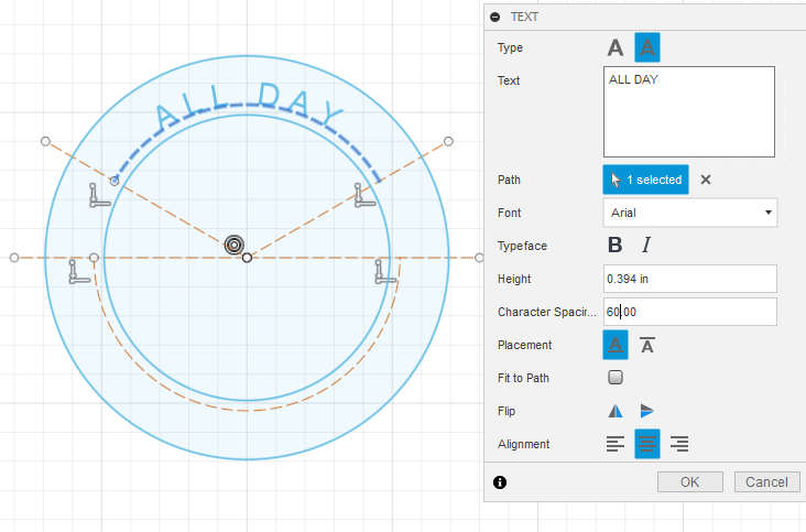
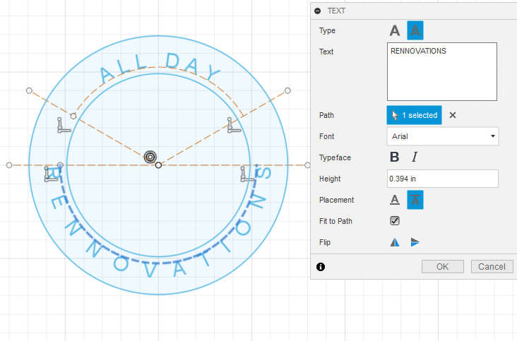
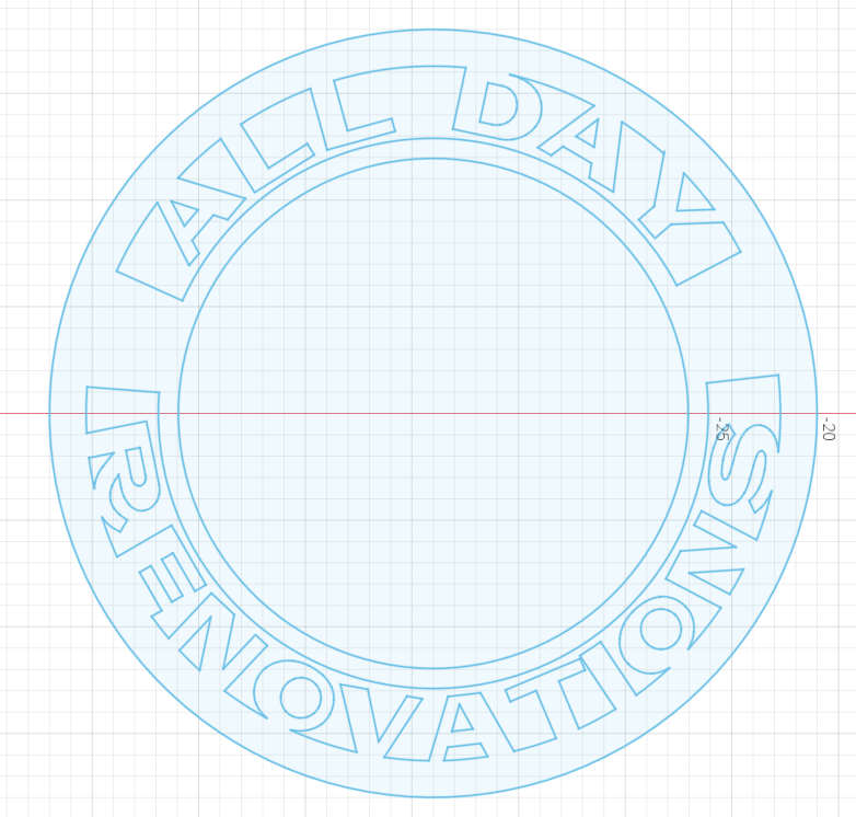
To help with spacing you can create construction ray lines and a construction circle. Use the snipping tool to cut away what part of the circle you don’t need and then place the text on the “arc” that is already centered on your sketch. You can use the “centering” positioning of text and then add “spacing” between text to get the letters to have more room. On the bottom arc I showed how “fit to path” used the entire arc and centered and spaced the letters for me.
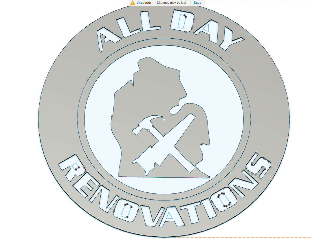
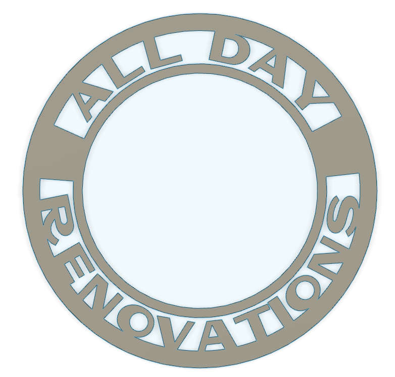
Final Drawing (I think) Please have a look, let me know what you think and don’t worry about being nice I would rather hear the truth! All Day Reno final v5.f3d (467.6 KB)
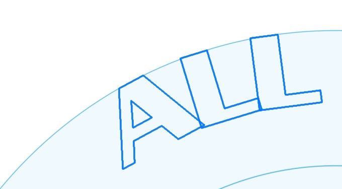
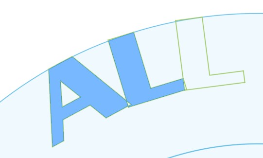
Looks good but you are going to lose the centers of your closed letters. You have to bridge the gap with some solid material to support the center. I did an example of the “A”. I also checked how close your letters were. Your spacing looks good. I have found that the nearest the lines can be and not damage the closest line is about 0.125. O.15 is better. You have met that criteria.
Here you can see how the “A” worked versus the letters without bridges. And, that bridge really needs to be at least 0.125 or better to be successful in the cut. Sometimes 0.125 is not enough.
I see you are also going to lose your center feature if you don’t bridge it with some element (spokes or something else). The line just central to you letters is going to be ignored by the CAM unless you select it and cut it with a centering tool. Even then it will cause the entire center of your sign to fall out loose. To deal with this, you will need to cause breaks in the line. To do that, one option is to do the radial construction lines and then use the snipping tool to cut out alternating segments of the circle.
In this example, I highlighted your central element and increased its size so it could collide with the outer ring. Then it will provide its own bridge to connect the elements. And now I see that the upper section on the butt of the hammer handle is likely to burn thru so that would need some attention. All in all, a good start. Congratulations!!!
As Jim said, you gotta finish your letters. That’s what I meant earlier when I said make them “stencil font” type letters.
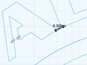
A few other things. The end of the hammer handle is very close to the adjacent line. I’d move the saw/hammer in, up, and rotate clockwise it a bit.
Get fancy and add some teeth on the saw. Sign is pretty big at 36", so you could easily add teeth big enough to cut successfully.
The top of the saw, just ahead of the handle looks like a stray point may have changed the shape just a bit.
Mounting features (if needed)? You can add some loops at the top, or a hole/holes foe screws. I know you said something about mounting the cutouts, so maybe no need.
Ok I am sorry I did not mention the cuts are getting mounted on a round piece of wood. I had no idea you guys would go to all this trouble. I did think about teeth but I will have to decide. I have so many hours into this. All of your guys advice really helped. Could don’t have done with out you help.
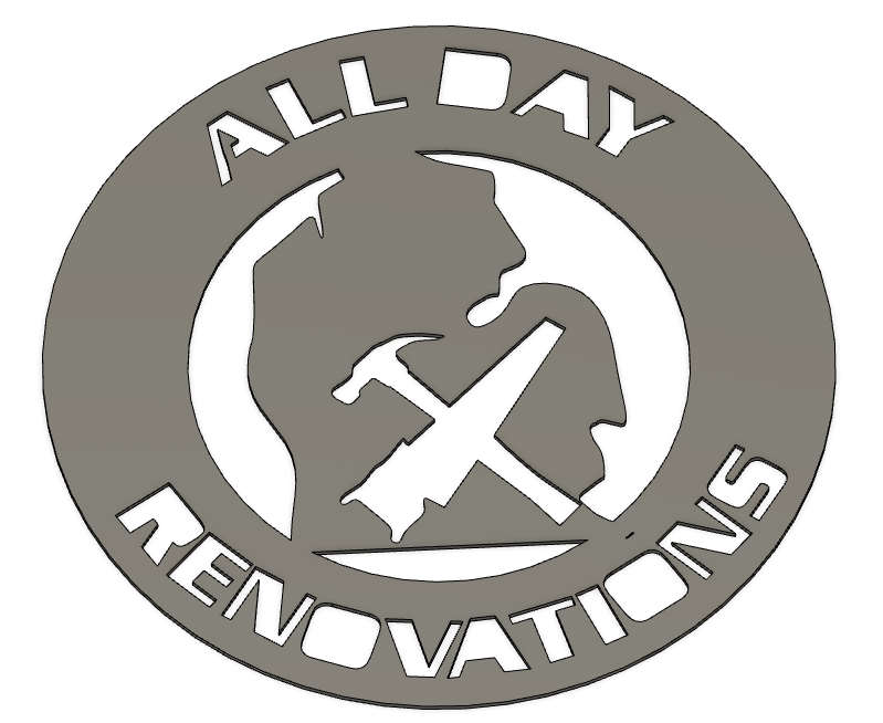
To help you better understand if you look at the original picture everything in that is white will be cut out and mounted to wood. Hope that makes sense.
Now I have to decide if I want to add teeth or not
This will not work for your current project but this is another way to spare the letters without turning them into stencils. Merge one side of the letter with part of the body and then delete. This will support the letter and the center features of the letter are free to fall out.