I am wondering why some of these letters look different. One R in repair looks different then the other?
When you look at it from the top down does it appear the same way?
May just be the perspective cutting through the layers.
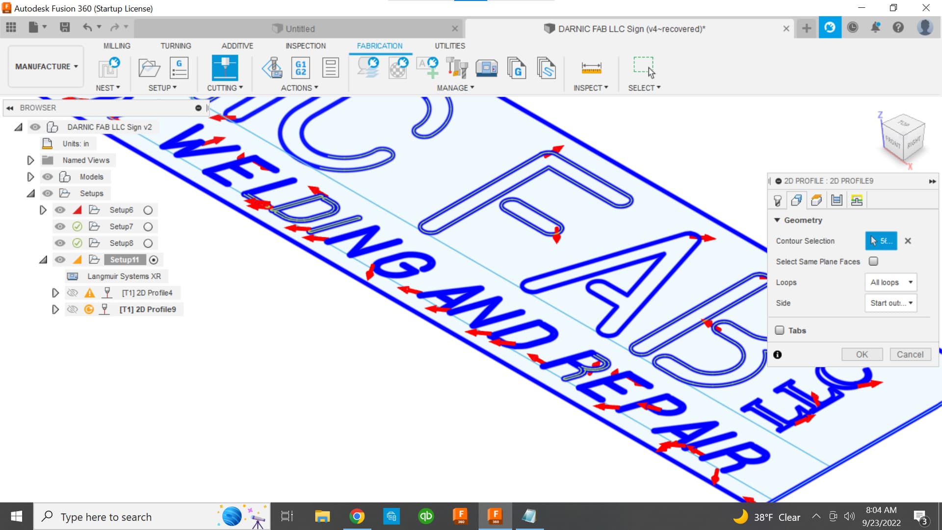
It appears you’re using a centerline cut for this operation? Doing so may distort your design intent.
If you post your F3D we could take a closer look.
1 Like
There may be other things wrong with this as its a work in progress.
DARNIC FAB LLC Sign v5.f3d (658.9 KB)
How was the original text created ?
I also had trouble getting the CAM to selection all the piece.
There was some odd geometry on the letters.

Layers of geometry

Odd geometry on the W
I projected the relevant geometry to a new DXF which removed the extra geometry
darnic fab fab projection.dxf (363.5 KB)
I create a new fusion file with that DXF and the process went smoothly.
DARNIC FAB shop sign tin mod.f3d (1.5 MB)

Using smoothing to the 2D profile menu is help for signs like this when making CAM.
1 Like
How was the original text created ?
Not sure what you mean. This was a sketch font I found online.
Did you use the text tool in Fusion 360 to create that font or did you import a SVG that had the text created in it already.
1 Like
My understanding was fusion uses whatever fonts you have on your computer. So I found this one online and downloaded it.
Once done it then showed up in fusion so I could use it. Hope that answers your question
1 Like
can you post that font . you can see from the picture above something is happening with the W, the arch is somehow wrecked .
I don’t *.ttf that is an allowed file extension on the forum. if you change the extension to *.dxf I can change it back to *.ttf after.
Yes but like all computer operations garbage and is garbage out.
There’s something wonky with that font and now I’m away from my desktop for the day and I can look at it again tonight or early tomorrow morning.
1 Like
That is fine, I have plenty to do. When ever you have time I am in no hurry
The top of the W in that font is a really bad jagged line. I typed a W in Inkscape and converted it to a path. Then I removed the fill and made the stroke as fine as possible. This is the top of the arc in the middle of the W. The top of the outer legs has a normal smooth arc.

2 Likes
@ds690 Definitely some junk geometry going on with this font.
There was a few of these micro oddities and some of them wouldn’t allow Fusion 360 to complete a closed contour.
2 Likes
So maybe I should find a different font
In the future I would use a better font than that., Yes.
But the f3d I linked to you above has those little errors fixed because I projected it to a new sketch and it did away with a lot of that odd mirco geometry.
1 Like
Ok so I zoomed in on the W and I see what you are talking about. Is that how you guys do it just zoom in or is there a faster way to do it?
I must be missing something, I looked at the file you fixed and zoomed in on it and it looks the same on the W I dont see any change it still has the jagged edge
When I projected it it’s just that Fusion is overlooking those mistakes that’s why I was able to pick up that geometry in the CAM.
Looks the same acts different.
It’s the first time I’ve seen a font with that kind of error.
1 Like
Ok Going to give this a try, couple of questions,
14 ga HR material
Will I need to worry about duty cycle on this cut? and if duty cycle does come into play how do you deal with it? Pause the program?
you recommend smoothing and I would think feed optimization too ?
I see ipm and amp setting vary a lot. I was thinking 35-40 amps at 120ipm?
Did you have a razor weld 45. ? I should remember but I don’t.
I just looked through his history. He has the RW45 Duty cycle 30% @ 45 amps. Doesn’t list 100% value that I could find.
2 Likes