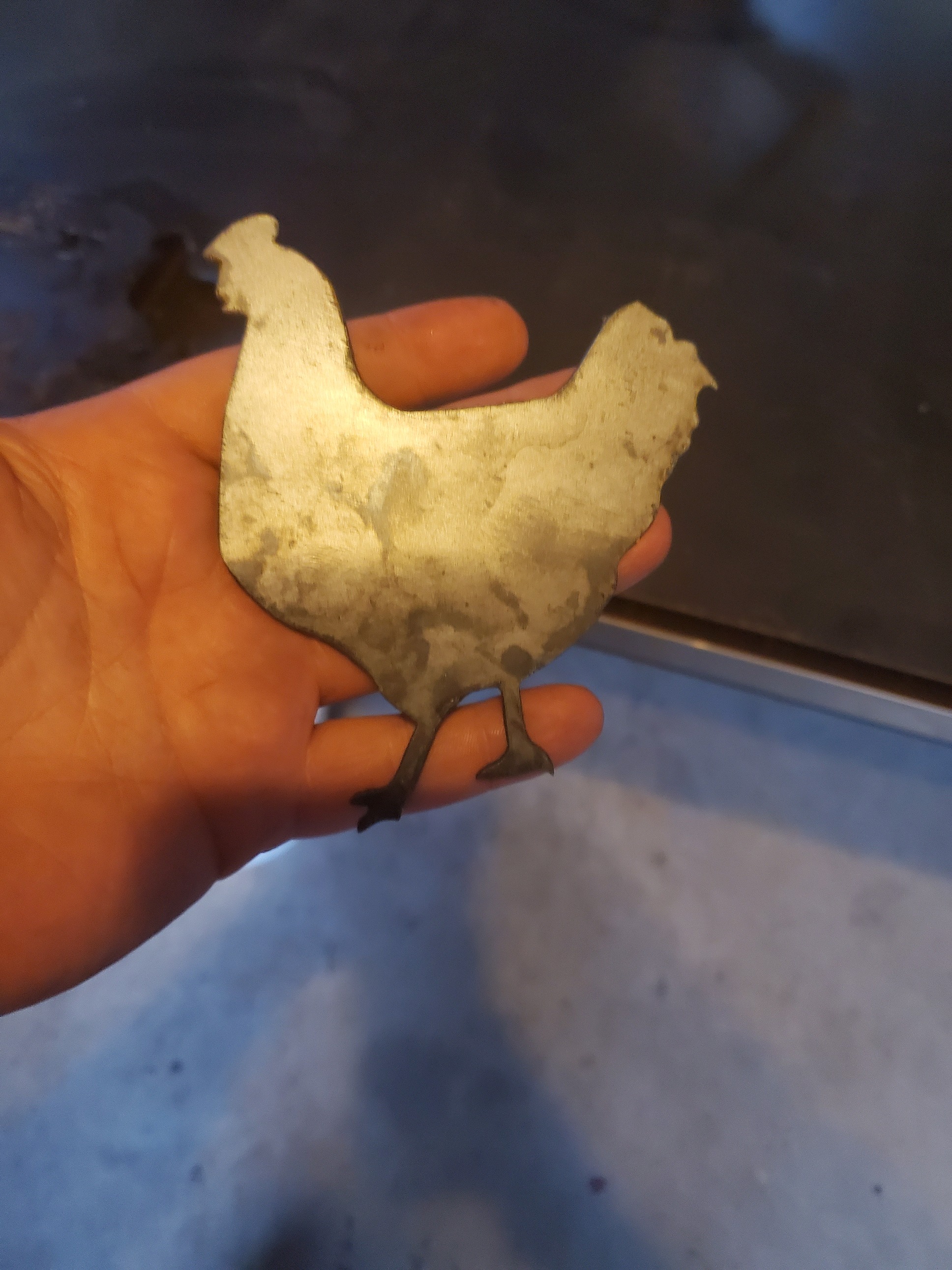
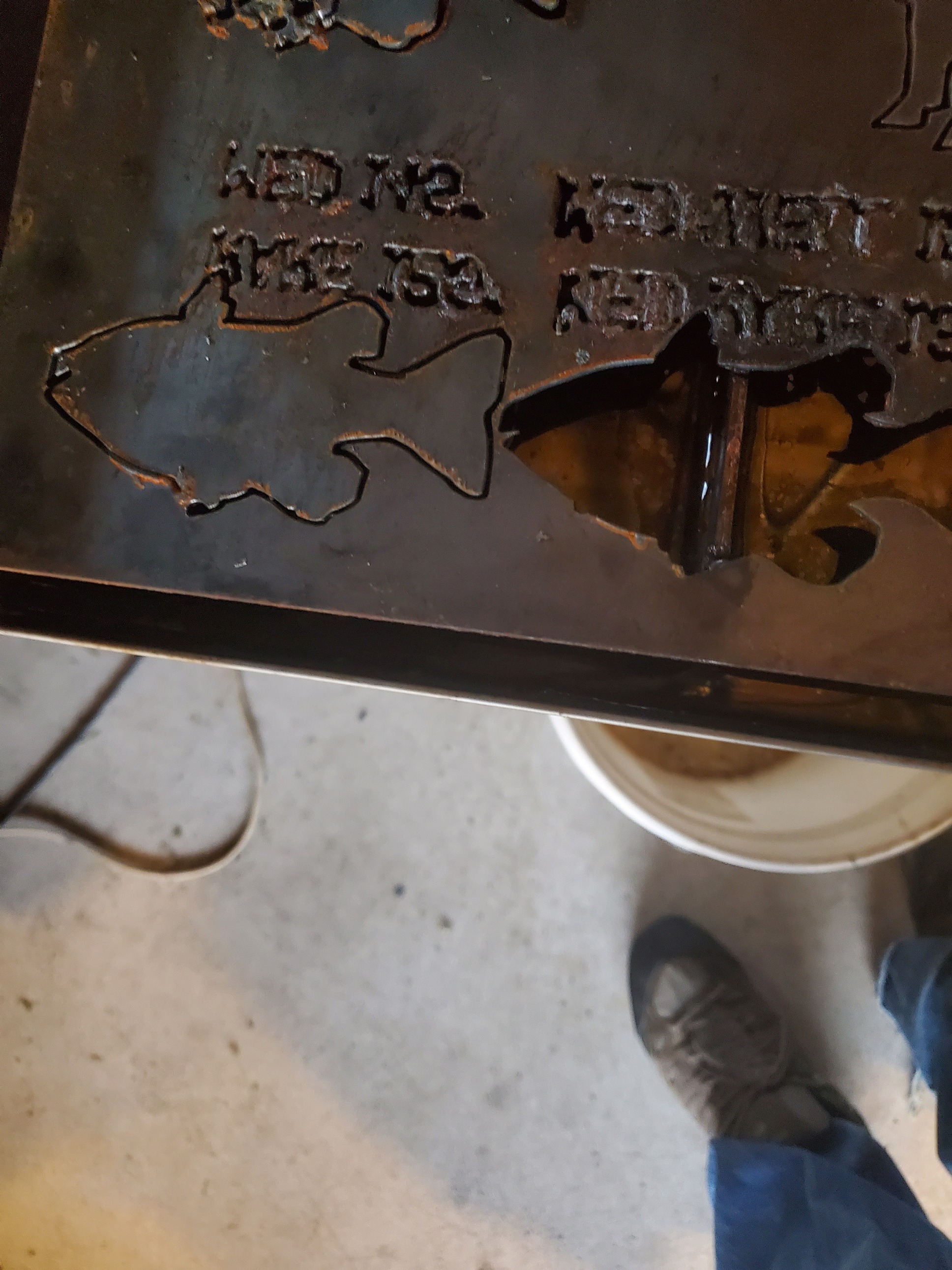
Hi, Im really new here and i have a question, i have just started to put together a few images and try to cut out. the shape cuts out nicely using the too set of the hypertherm 45 settings, but the letters and numbers inside are a mess, i was woundering if anyone had any helpful tips. here are some pic. of it . The cow is 7 inches wide so it might be too small of a font maybe? i wanted to start with small projects first so thats why they are small. any help would be helpful, thanks.
First, do you have a hypertherm cutter? If not the settings won’t be accurate.
Just at a glance, the font is probably too small. Did you get any errors when toolpathing?
Looks too fast and like you may be having too short of a pierce delay as well. Post your whole setup ie: air, cutter, and software.
I’m getting ready to finally experiment with fine cut consumables for my 45xp, excited to see how good of cuts I can get.
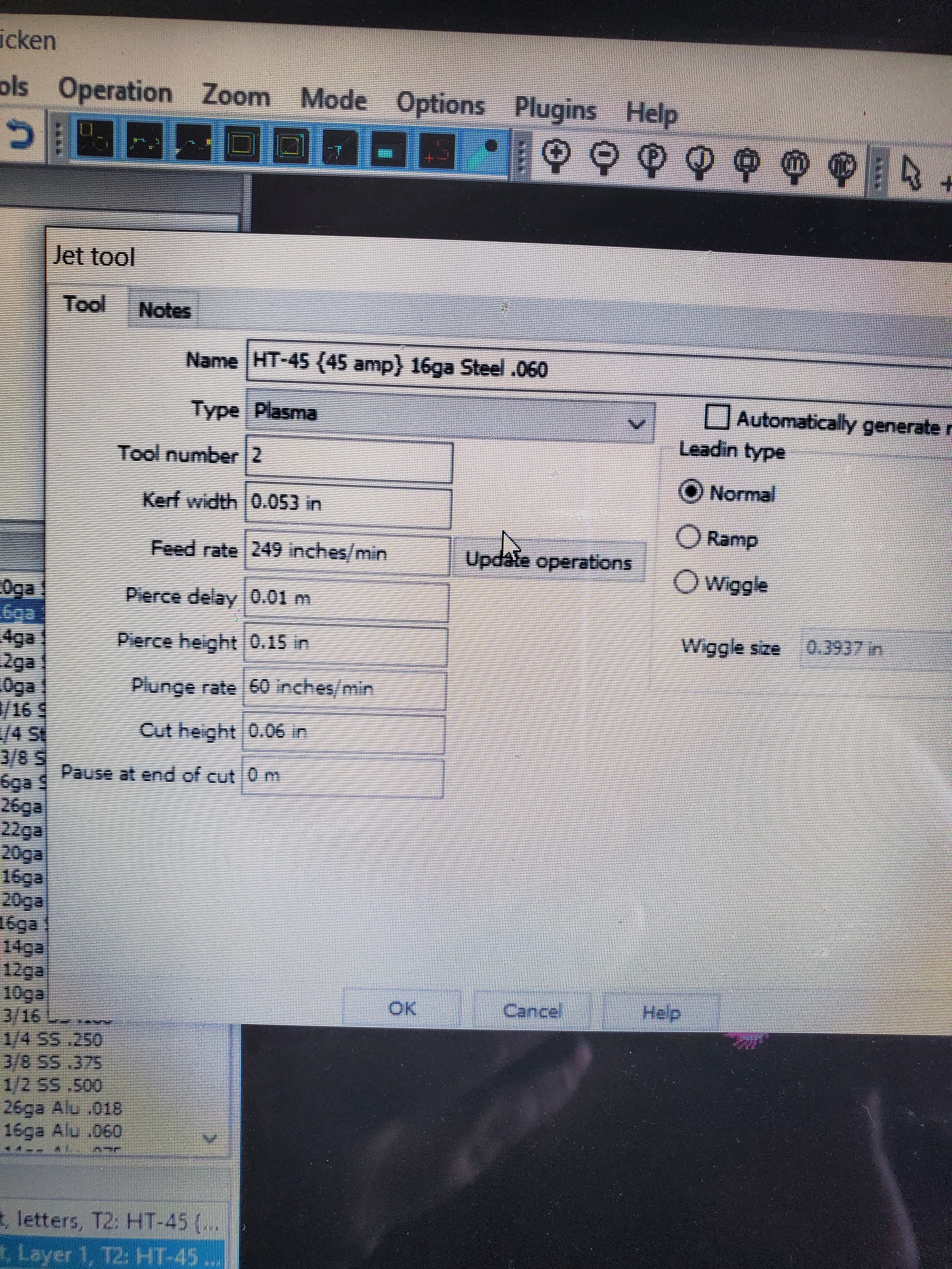
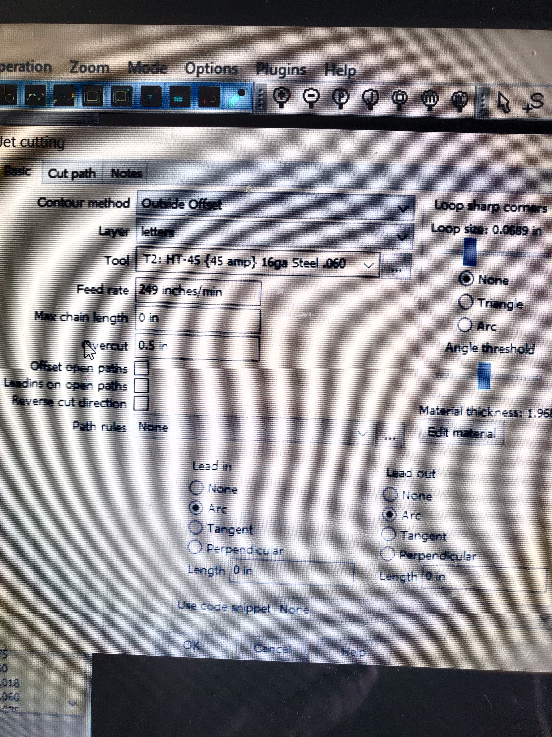
No, i have the Razerweld45, I bought the crossfire pro with the thc and the water table, I have a 60 gal compressor and a air filter and water separator on it, I use Inkscape and Sheetcam for my software, I was reading the fourms and seen most people find Sheetcam easier to use, So i decided to go that path as well, i didnt get any errors for the font it just comes out horrible. i downloaded the hypertherm toolset and the 45xp tool set, and i think they are the same(for 16 gauge), and reading the fourms i seen alot of people asking for hypertherm tool set and they said they have the razerweld 45. I did read on another fourm that you were getting ready to cut smaller pieces, I think thats where i got the 45xp toolset from, Hopefully it goes well. Im just like i wont learn unless i try and i knew i was gonna fool a bit up, its all apart of learning. Below are my setings in sheetcam.

The Hypertherm settings are going to be too fast for the RW. I don’t know that the font is too small - a lot depends on your consumables. Are you using the standard tips (.09mm used to be standard with the RW)? I would use 0.6mm if you can find them for your torch. If you do you’ll want to reduce your power too - 25A-30A for that fine cutting.
You may not be able to cut out fonts that size (I can’t tell how big they are) if they are enclosed shapes (outlines where the font drops out of the material). You may want to change to single-line fonts (often called Hershey Fonts or engravers fonts) and do no-offset cuts.
1 Like
ok ill look into hershey font, and ill try to redo my toolset for razerweld 45, i think my tip is 0.6 mm, i tried looking but didnt see anything showing its 0.6 mm… i can say that the outline doing 247ipm came out really nice and i didnt have to clean it, but i might have gotten lucky.
A 0.65mm cutting tip is only rated at 20 amps and the orifice hole is about .025"
1 Like
16 ga 30 amps, pierce height 0.15, kerf width 0.06, cut height 0.06, speed 90 ipm lead in and out arc 0.15. Same settings for 1/8 but 35 amps speed 50 ipm. For 1/4 same settings but 45 amps and speed 24 ipm. For 5/16 same settings but 45 amps and 20 ipm. I left all my settings the same and it cuts great. Its not going to run at hypertherm speeds. I get really nice cuts with no dross on top and very minimal on the bottom that knocks right off with a cup brush.

Thank you, can i ask what font that is?
Ill have to look tomorrow. I meant to send this earlier. I use cad to change the font to lines. There are some stencil fonts for free online it is one of them… The font is probably too small. I’ve noticed when I use Inkscape and save as a dxf it creates an inner and outer line for everything. I open the file in free librecad and delete either the inner or out line. If both are left in it will try to cut them both.
1 Like
Fonts when converted to curves will always have and outer and inner, at least from what I’ve been using.
In Affinity, I use the add tool to merge all paths at once. If you have a stroke I think it may create the double lines you are talking about. Can you remove the stroke and see if it doesn’t generate the double paths?
affinity has a tool called expand stroke which merges the stroke into the shape and makes one path. Inkscape may have something similar. I’ve seen the stroke show up in sheetcam before, but I only work with svg and don’t convert anything to dxf.
@SWomack that sign looks great, you’ve definitely got the settings nailed. I need to get mine figured out that well.
The font is called Anoxic. I found it free online.
2 Likes
I have very similar settings as SWomack for 16 ga and I cut some fairly small and detailed stuff, roughly 30 signs a week with no real issues. I use a Razorweld 30i, I also always use no offset for text.
16ga - 29amp - 120ipm - .08 consumable - .08 kerf width - lead in/out .1
What font did you use there?
i have a RW45 and cut everything at 45 amps and just change my IPM. I just use standard consumables no fine cut.
I cut 14 ga @ 120 IPM not sure I have ever cut 16 and if I did I don’t know what IPM maybe 150 IPM.
1 Like
Three posts below that, he says the font is “Anoxic”.
For anyone else replying - This is a 4 year old thread, I think the OP got the answers they needed.
4 Likes
only 4 years old? hmmmmm I really need to pay attention!
2 Likes
The font is called Anoxic. I found it free online.
1 Like

He’s going to cut a sign with an explanation of the Ontological Argument and all it’s potential criticisms debunked.
Just use comic sans or papyrus and get it over with.
1 Like