I’m trying to cut a text intensive sign with 1 inch letters. I downloaded a Times New Roman Stencil font. My first attempt to cut dropped a few of the lower case e tops and a few of the lower case g bottoms until it dropped out a middle of an N and stopped the program when it lost connection. Last evening I spent several hours increasing the size of the bridges on the letters that screwed up. A second attempt this morning dropped out different letters. I plan to increase the size of any remaining bridges that I can find, but was also considering increasing my kerf size to try to “trick” the cutter to make the insides of the cuts a little smaller and in effect increase the bridge sizes. Does this sound like a reasonable thing to do or am I barking up the wrong tree? Thanks
Text can be very tricky! I use fine cut tips on my signs and always leave at least 0.1" on tabs/bridges of letters. Always watch cut path simulation for tails and see tight areas. You can send me your sign and i can take a look at it and give you feedback whenever needed.
@brownfox
Jon has done some AMAZING Text signs…maybe he will see this and chime in…
Don does lots of great work so he speaks from loads of experience.
I have a fine-cut set up available for my Hypertherm 45 XP but have not used them yet. I am using the standard cutting consumables and find that I need at least 0.125 inches between all cuts for them to survive for the bridges that support the inner stencil part of letters. That is when I am cutting 12 gauge and thicker steel. For 16 gauge, you can turn down the amperage and get by with 0.11 between cuts.
But, if you support the entire letter on one side, such as on this sign:
I found that the letters could survive smaller spacing and you can use regular letters instead of stenciled letters. If you look at this area:
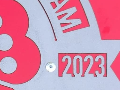
I was able to get very good survivability of the letters. The spacing at one point, is less than 0.1 inches:
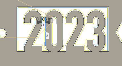
That illustrates letters as close as 0.086 inches and the text came off very clean with standard cutting nozzle.
Really the best thing to do is make a few different size bridges for letters like “O” or “A” and see what you can find as your safe width for text. Learn how to use line contour and make the bridges easy. Everyone is using different machines and setups and what works for one might be a little different for another. The more you cut the better and easier things will get for designing signs.
Thanks for all the input! I’ve had the machine running for about 8 months and getting along fairly well but I mostly do repair part stuff for the farm. Not quite the detail this involves.
The sign is on 16 gauge, I’m using a Hypertherm 65 sync with the 45 amp finecut consumables for this project. I haven’t messed with the amperage setting on the Plasma have just left it at the 45 amp. It seems like it has it cutting a 250ish inches per minute. I’m using the cut charts that came with the Plasma. Would lowering the amperage and the cut speed help?
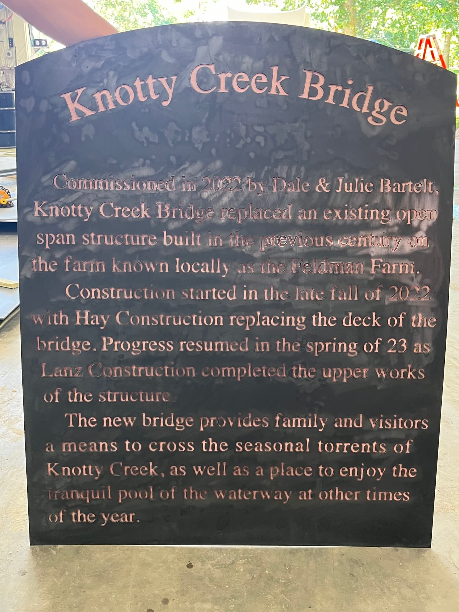
The pick is of the first attempt of the sign. I designed it in Fusion, and with that much text has slowed down editing to a crawl, making fixing all of the bridges an even bigger pain.
Again I appreciate the input. This forum and its contributors is a great resource!
Wow! That is a lot of letters!
Yes. It did for me. A good starting point would be for 16g steel, set to 30A, and try setting the kerf at .025” and at 150ipm. These are settings that @Cletus came up with and I tried it and it was a miracle for the project I was working on. 45A is really too effective with 16 gauge so you have to move so quick just to spare the material.
Keep in mind, I was using the standard consumables and not the fine-cut.
This looks great! I would keep your settings the same and just double the bridge/tabs on letters like e, d, g, etc. I might also consider using new electrode and tip if current one has some age but don’t throw away your old ones because you can still use it on normal stuff. I have a Hypertherm 45xp and run 40amps @ 150ipm but your letters look good except the tabs.
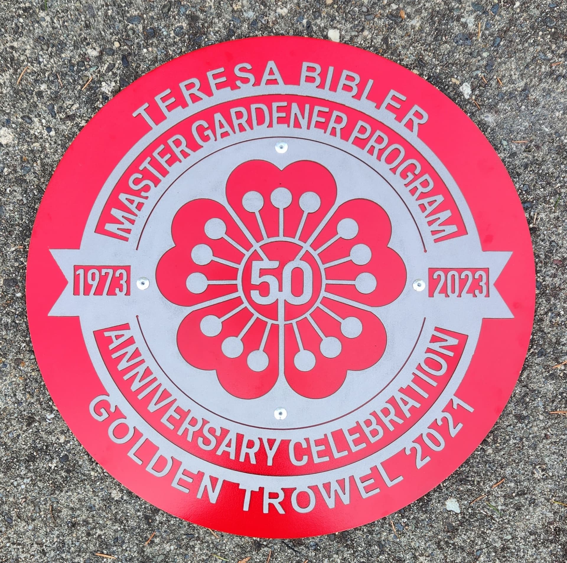
I won finally! I increased the bridge sizes on all of the letters that needed it, and had my kerf set to .030. It was a very nerve racking hour waiting for it to finish cutting. Thanks for all of the input!
I plan to cut out a larger sheet that will have a 1 inch or so reveal to put behind for the backer.
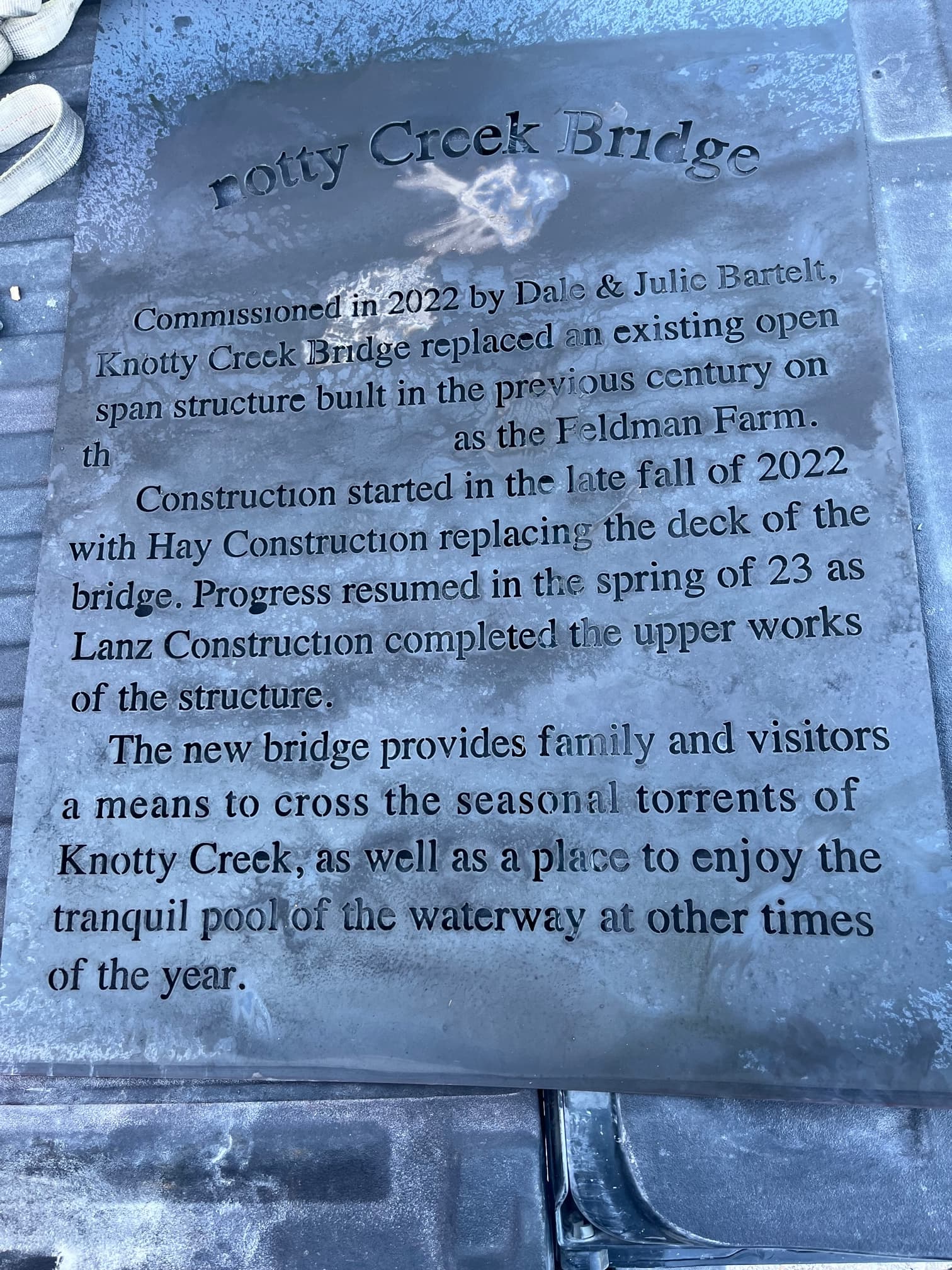
Thought you all might be interested in a pic of the bridge it’s for. I did the sign on the bridge as well. it was a whole lot easier!
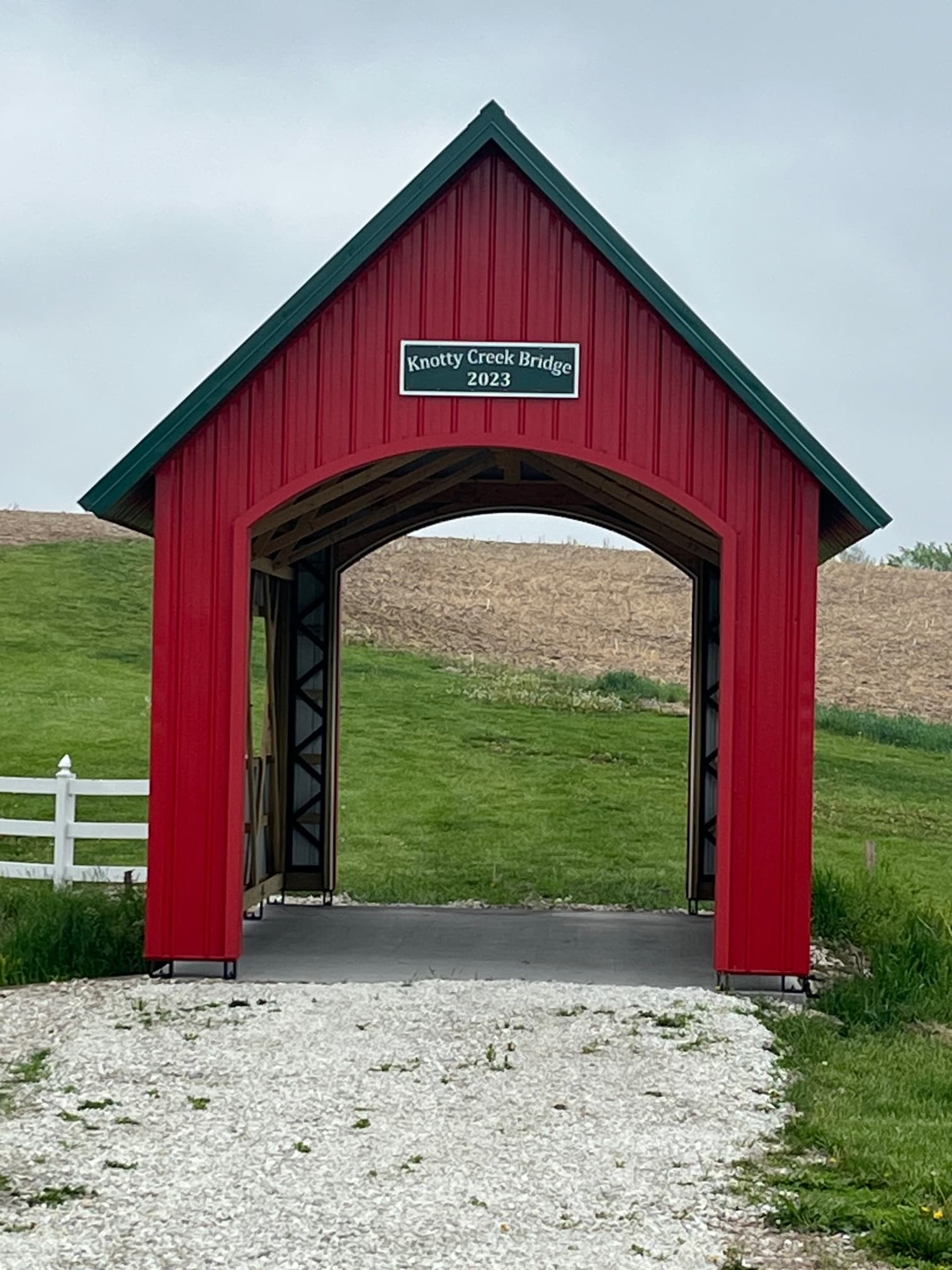
Did you help build the bridge also? Looks very cool!
Your sign came out very nice and will be a nice addition to the Barn! Well done
It was worth it. The sign looks great. Definitely the kind of professional job you’d expect to see when visiting a historical location.