Here’s a video I just posted. You might find this useful in your sign making.

Here’s a video I just posted. You might find this useful in your sign making.
Very nice, Craig. Looks like there might be a bit of a learning curve with FontForge but what a great time saver in the long run.
What did you use for making your video: great visual and audio production?
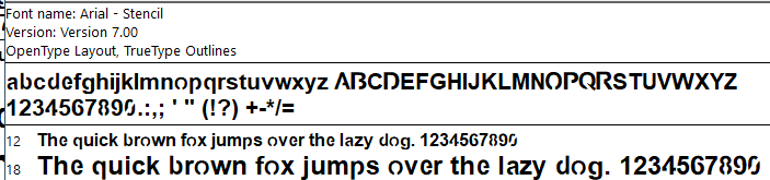
Thanks. I looked through hundreds of fonts to choose for bridging. I wanted large features without fine details.
Yes, there’s a fontforge learning curve for sure. My example only used straight lines. Straight cuts look horrible for bridging certain fonts/letters. Moving to next fontforge level involves learning the node types and what those little handles do. If you’ve run illustrator or inkscape then it’s fairly easy to figure out.
As for video production, for this video I used OBS capturing the screen. I changed my monitor to 1920x1080 because I post 1080p mp4s to YouTube to avoid YouTube scaling it. For audio, I have a nice mic with a mixer with USB output.
To edit video, I use Davinci Resolve. I’ve been using DR for 3-4 years, it works great. The latest version has an awesome voice isolation feature that kills all background noise. DR has a fully capable free version.
If I need a multi camera shot, I use Sony Alpha cameras with HDMI output fed into a Blackmagic ATEM Mini Pro ISO as a switcher/recorder. It integrates directly with Davinci Resolve. At the shop, I just use my phone or a cheap GoPro clone.
I make a lot of videos for work and stuff. I have a lot of other video gear. Got any other questions?
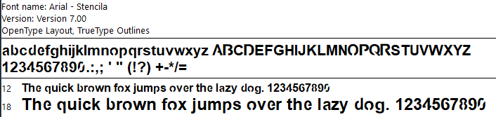
Well… you made me learn some things today/tonight. I really do not know Inkscape and tried to learn FontForge. Through the process, I did create a stenciled version of Arial Bold. For those who may want to try it, here it is:
Arial-BoldMTStenciled.ttf.pdf (906.9 KB)
To use it, you need to remove the tail of this file “.pdf” and install in your FONT folder.
You will find, many of the letters are not uniform in size. I had to do the editing of the actual letter in Inkscape and then have FontForge help me put it back into the sequence.
Wow, didn’t expect anyone to try this, let alone immediately. Good work and thanks for telling me. Here’s a little more info from my 6-8 fooling with fontforge to figure this out.
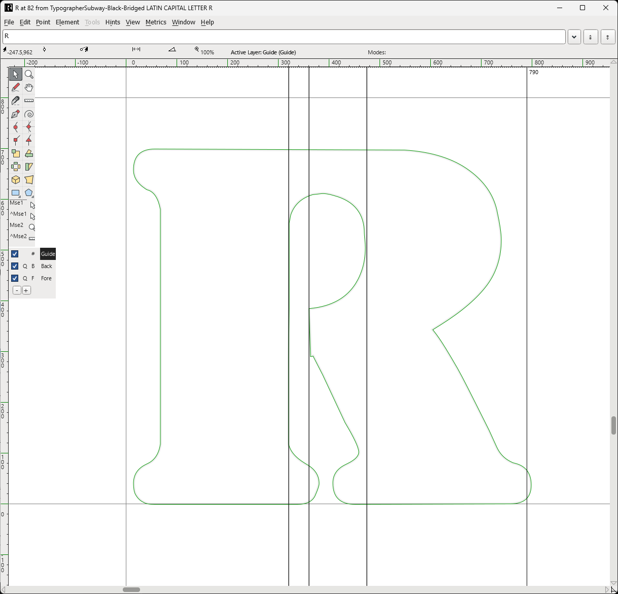
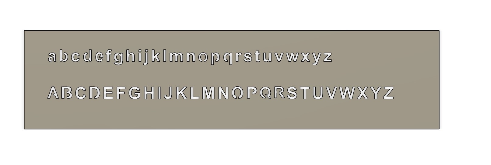
One afternoon with my XPro I experimented with bridging widths for 1.5" letters in 18ga steel. Sorry I don’t remember the exact width in inches but I do know the equivalent in fontforge. It’s 40 Em.
You can drag some vertical guides from the left ruler.
I drag one to one side of the bridge the drag the other 40 ‘units’ away. I believe the ruler unit in font world is ‘Em’. If you can’t get the guides to work, the active layer has to be guide. See that black square near the bottom of the left toolbar.
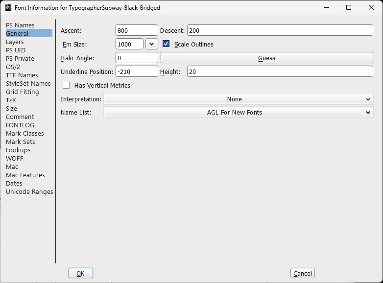
This number 40 is related the ‘Em size’, shown here from the ‘font info’ dialog under General.
All the fonts I played with, the Em size was 1000, so 40 works.
Also, when you’re moving around, your mouse position is the upper left corner under the little black arrow icon. Sorry but I can’t capture that with the snip tool.
I’ve attached my fontforge file for TypographerSubway font work, remove the pdf extension, open in fontforge.
TypographerSubway-Black.sfd.pdf (370.3 KB)
Hope this makes sense. Like I said in my previous post, the next level is learning the node types, which gives you handles to drag to control the curve at a point. Right click on point to change its type. If you don’t see the points, view->show->points or control-d. You can also remove a point from a curve by right click, select ‘merge’. This is different from deleting it which deletes it and the line segment.
Hope this helps. I bridged about 5 fonts one afternoon. Once you understand the process and the point types, it takes about 20 minutes to bridge a font. Also, I looked at several free font sites and I found that 1001fonts.com has a great search engine, shows you the letters of font set and the usage license. Note: some free fonts don’t include a full character set.
Got to go. Congratulations on bridging your first font!
After what I went through, I certainly appreciate/understand that!
Oh, don’t tell me that! I now feel like a complete failure! ![]()
No worries, the first one takes forever!
Yesterday, I had visions of the first time I tried to manufacture or even draw a part in Fusion 360. Even the most basic/simple tasks seemed unreachable.
I am glad of what I learned yesterday because I have wanted to get a better understanding of Inkscape. Up until now, I have only spent about 3 hours in that program over the last 2 years. So yesterday involved learning some of two different programs.
Don’t get me started with my Fusion 360 day 1 and I’ve resisted inkscape as well. I used Mac illustrator all the time around 1990 in college. It was simple back then and powerful to use. But now, old dog-new trick only after hours of struggle.
Corrected the sizing of the stenciled Arial Bold font:
Arial-BoldMTStenciled.ttf.pdf (907.9 KB)
(Note: remove “.pdf” from the file name to actually use the file)
One more revision made. Last time the small “o” seemed a bit thin. This version has the small “o” a bit thicker.
Great work…I have found that some of the ttf files just don’t work in fusion 360 but all your letters look good. Thanks!
Ahhh…you guys are too much. You are making me feel successful with my new @holla2040-skill.
Part 2